There’s a new update available to the Martin Luther king Font. You can download the font from your account:
You are new? Download the font for free here:
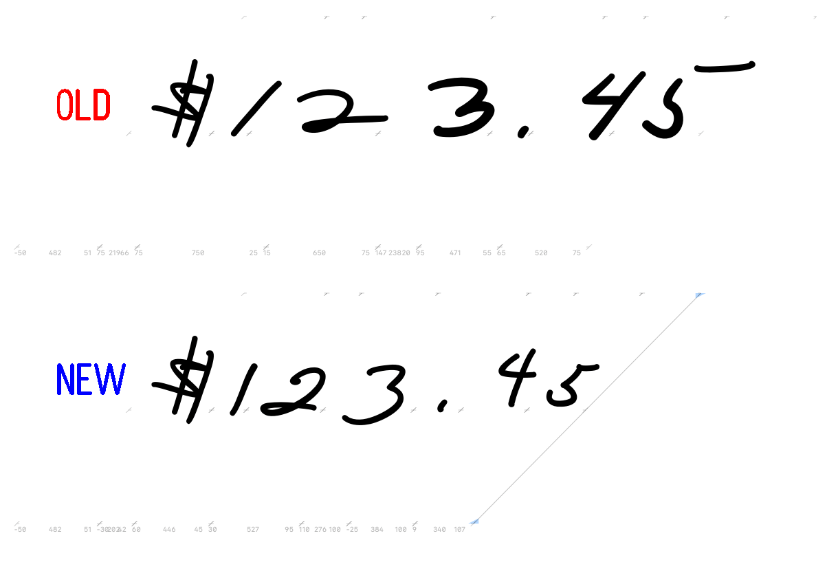
This Update adds the numbers: 1 2 3 4 5 and an alternative period.
The new version will show up in your font menu as “Martin Luther King 2021 March”. I recommend uninstalling older versions to keep your font menu organized.
A big “Thank you.”
to everybody who supported the creation of the font this month. This update is possible because of the financial support of 23 people from around the world. I want to take some space to thank them:
J. Harris, Montgomery, Al 🇺🇸
J. Horton, North Turramurra, NSW 🇦🇺
N. Renner, New Britain, CT 🇺🇸
B. Desclee, Brussels 🇧🇪
K. Engelbrecht, Bern 🇨🇭
R. Wampler, Colorado Springs, CO 🇺🇸
D. Chamberlain, Benicia, CA 🇺🇸
H. de Wolf, Zaandijk 🇳🇱
K. Tilley, Linthicum Heights, MD 🇺🇸
C. Smith, Nedlands, WA 🇦🇺
J. Ford, New York, NY 🇺🇸
P. Herman, Bonsall, CA 🇺🇸
F. Chaplais, Ile de France 🇫🇷
J. Holze, Magdeburg, Saxony-Anhalt 🇩🇪
N. Wilson, Broken Arrow, OK 🇺🇸
N. Faulkner, Bournville, Birmingham 🇬🇧
T. Zwitserlood, Amsterdam, NH 🇳🇱
J. Wilson, Nashville, TN 🇺🇸
G. Sjölin, Örebro 🇸🇪
R. Lindsey, Grand Terrace, CA 🇺🇸
H. Colsman-Freyberger, Mannheim, Baden-Württemberg 🇩🇪
F. Engerer, Nürnberg, Bavaria 🇩🇪
H. Billetter, Kerpen, North Rhine-Westphalia 🇩🇪
join the list of supporters:
Transparency is important. Please find a detailed spreadsheet with the total number of supporters and donations →here.
Let’s talk fonts.
Benchmark:
How close does the font come to the original?
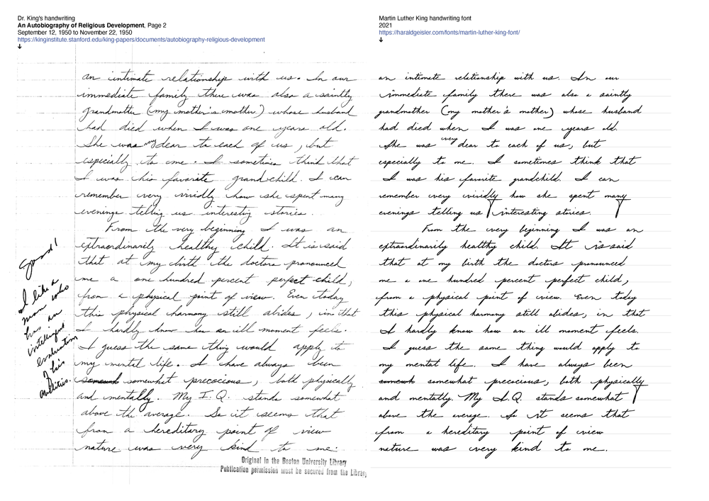
On the left side you see the original manuscript and on the right side the same text set with the Martin Luther King font.
A significant step for me in creating a font is to compare an original manuscript with the font. I have added a PDF (Martin Luther King font comparison.pdf) to the font files. In the document, you can see the font side by side with an original manuscript.
My aim here is not to create a copy of a page but to capture a hand’s aesthetic so that the page is not a copy but could be the second page from the same writer.
This overview and comparison gives me a good insight into where the font needs improvement and where to continue work in the future.
Why new numbers?
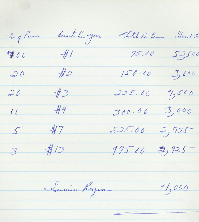
In the January update, I mentioned that almost all the alphabet letters are now in the font (capital Z is still missing). Now I focus on marks and signs. While looking for missing characters, I came upon the last page of Dr. King’s seminar notes on Social Philosophy from October 3, 1961, to January 23, 1962 (view the complete binder online at The Martin Luther King jr. Research and Education Institute at Stanford University.) In the sample, we can see a lot of numbers.
Note the different fives at the beginning or end of a number.
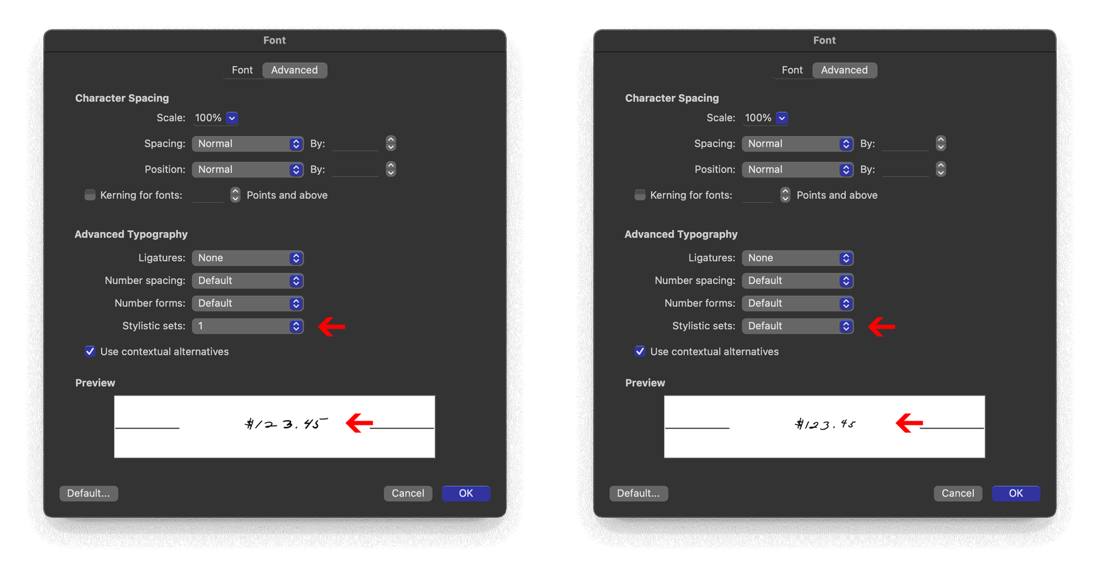
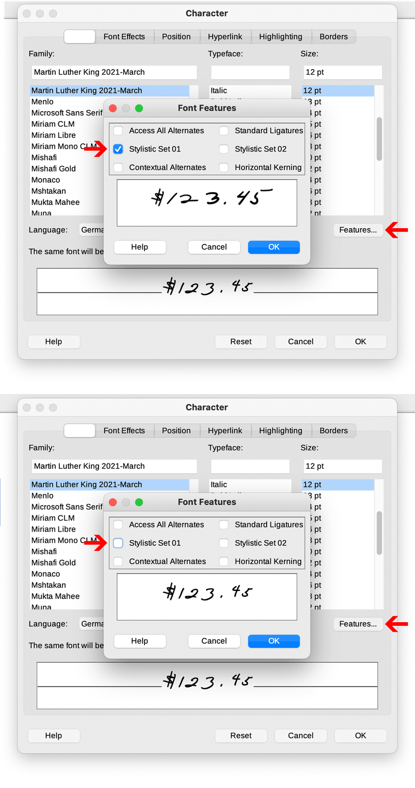
The former numbers remain in the font and are stored in stylistic set 1. You can switch between the different numerals through the advanced typography menu. In some contexts, one set may be more suitable than the other.
In Word, you can reach the menu with these short cuts:
Ctrl+D or Ctrl+Shift+F on PC
or
Command+D on MAC.
In Libre Office, you can change the stylistic Set through the character menu and then pressing the Features Button.
Future Outlook
In the next update, I will add the missing numbers. An exclamation mark or question mark is still missing. And I am still very excited about the initial and final letterforms for future updates.
Support the development of the Martin Luther King font.
I enjoy working on the project very much; I hope you enjoy the font. Without support, this project would not be possible! The more people support the project, the more time I can spend working on the font. I will add one additional letter for each 100€ ($110, £90) donated monthly. If you want to support: please donate monthly. The continuity will help me and the rhythm of the project. Thank you.
