There’s a new update available to the Martin Luther king Font. You can download the font from your account:
You are new? Download the font for free here:
This update adds letterforms and fixes the size of the new numbers that shipped with the April Update. And finally, I have added a new PDF to showcase the font.
The new version will show up in your font menu as “Martin Luther King 2021 May”. I recommend uninstalling older versions to keep your font menu organized.
A big “Thank you.”
to everybody who supported the creation of the font this month. This update is possible because of the financial support of 22 people from around the world. I want to take some space to thank them:
J. Harris, Montgomery, Al 🇺🇸
J. Horton, North Turramurra, NSW 🇦🇺
N. Renner, New Britain, CT 🇺🇸
B. Desclee, Brussels 🇧🇪
K. Engelbrecht, Bern 🇨🇭
R. Wampler, Colorado Springs, CO 🇺🇸
D. Chamberlain, Benicia, CA 🇺🇸
H. de Wolf, Zaandijk 🇳🇱
K. Tilley, Linthicum Heights, MD 🇺🇸
C. Smith, Nedlands, WA 🇦🇺
J. Ford, New York, NY 🇺🇸
P. Herman, Bonsall, CA 🇺🇸
F. Chaplais, Ile de France 🇫🇷
J. Holze, Magdeburg, Saxony-Anhalt 🇩🇪
N. Wilson, Broken Arrow, OK 🇺🇸
T. Zwitserlood, Amsterdam, NH 🇳🇱
J. Wilson, Nashville, TN 🇺🇸
G. Sjölin, Örebro 🇸🇪
R. Lindsey, Grand Terrace, CA 🇺🇸
H. Colsman-Freyberger, Mannheim, Baden-Württemberg 🇩🇪
F. Engerer, Nürnberg, Bavaria 🇩🇪
H. Billetter, Kerpen, North Rhine-Westphalia 🇩🇪
join the list of supporters:
Transparency is important. Please find a detailed spreadsheet with the total number of supporters and donations →here.
Let’s talk fonts.
This update adds two new final letterforms, lowercase g (1) and y (2), and an alternate version of the initial lowercase i (3). Further, the update fixes (4) the size of the new numbers that shipped with the April Update. And finally, I have added a new PDF to showcase the font. Let us dive into the details…
Usage Tip: Not sure how to activate Initial and Final Forms? →Update #16 covers that. Click →here to see a video of how to do that!
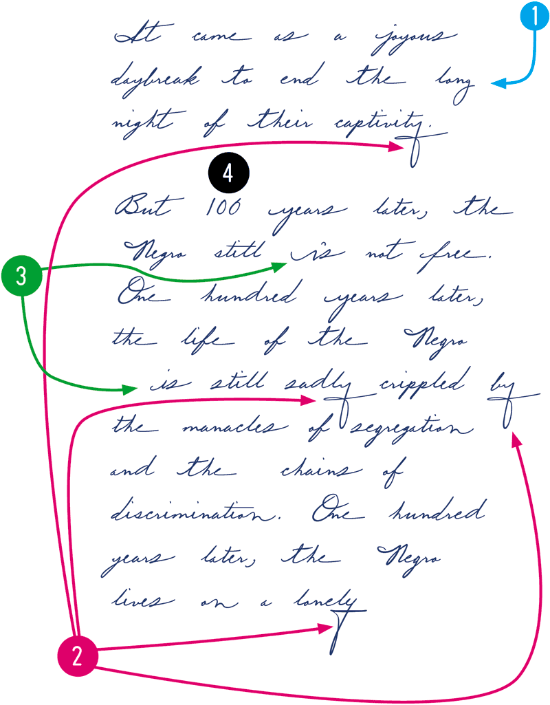
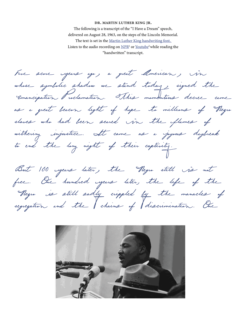
I have a dream “handwritten” transcript.
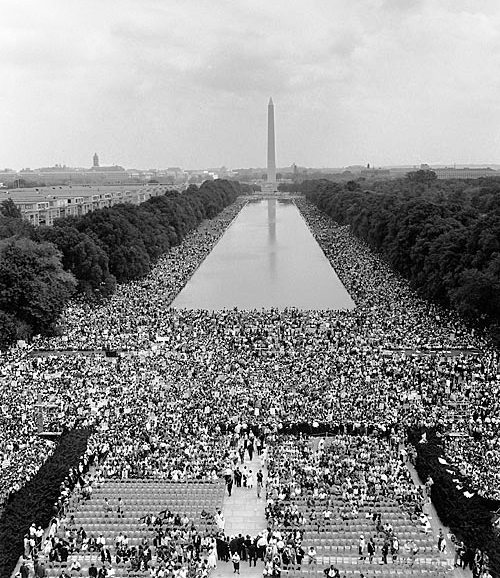
This image shows the view from the Lincoln Memorial toward the Washington Monument on August 28, 1963, the day Dr. King delivered the now historic “I have a dream” speech.
In the description of the Martin Luther King Font, you can read: “My aim with these handwriting projects is to open the door to the content of an author through the aesthetic of handwriting, and the general interest for typography and fonts.” and: “We all know what his voice sounds like, but as a typographer I became curious: how did he prepare his speeches and organized his thoughts in writing, and what does Dr. King’s handwriting look like?“
From the beginning of this project, I noticed a difference between the historical figures of my other handwriting fonts. It is easy to find out what Einstein or Freud looked like, but usually, it is difficult to hear a person from the time before the Second World War. However, because Dr. King is often quoted in his voice, it was clear to me what he sounded like.
A recorded voice conveys tone, speed, rhythm, and timing. While thinking about how speed, rhythm, and tone affect the content of a speech, I remembered a moment in a calligraphy class that I took years ago. We discussed that in religious calligraphy, words would be written with a specific speed. Instead, speed has to be adjusted to the spiritual context of a phrase.
Choosing a handwriting font instead of regular fonts usually makes the reading longer. Just like it takes longer to listen to a person speak than to read a transcript. I asked myself how the reading experience would change if I read Dr. King’s “I have dream” speech set in his handwriting.
Said and done. Included with the font, you will find a PDF of the speech set in Dr. King’s handwriting. In the document, you will also find a link to an unabridged audio recording from NPR so that you can listen and read along.
I am curious to hear from you if this typographic experiment changed your reading experience. And as I set out in the beginning “opens the door to the content of an author.”
You can support the development of the Martin Luther King font.
Two ways to support the Martin Luther King font.
This project is very dear to me; I hope you enjoy the font. Without support, this project would not be possible! The more people support the project, the more time I can spend working on the font.
1. Spread the word.
Share this email or share a link to the project site: https://haraldgeisler.com/martin-luther-king-font with friends, family, and colleagues you think would be interested in the font.
I like to download…
2. Donate regularly to the font.
I will add one additional letter for each 100€ ($110, £90) donated monthly. The continuity will help me and the rhythm of the project.