There’s a new update available to the Martin Luther King Font. You can download the font from your account:
You are new? Download the font for free here:
This update adds five new letterforms, lowercase l (version 2), and initial letters a, c, o, and s.
The new version will show up in your font menu as “Martin Luther King 2021 August”. I recommend uninstalling older versions to keep your font menu organized.
Transparency is important. Please find a detailed spreadsheet with the total number of supporters and donations →here.
A big “Thank you.”
to everybody who supported the creation of the font this month. This update is possible because of the financial support of 22 people from around the world. I want to take some space to thank them:
J. Harris, Montgomery, Al 🇺🇸
J. Horton, North Turramurra, NSW 🇦🇺
N. Renner, New Britain, CT 🇺🇸
B. Desclee, Brussels 🇧🇪
K. Engelbrecht, Bern 🇨🇭
R. Wampler, Colorado Springs, CO 🇺🇸
D. Chamberlain, Benicia, CA 🇺🇸
H. de Wolf, Zaandijk 🇳🇱
K. Tilley, Linthicum Heights, MD 🇺🇸
C. Smith, Nedlands, WA 🇦🇺
J. Ford, New York, NY 🇺🇸
P. Herman, Bonsall, CA 🇺🇸
F. Chaplais, Ile de France 🇫🇷
J. Holze, Magdeburg, Saxony-Anhalt 🇩🇪
N. Wilson, Broken Arrow, OK 🇺🇸
T. Zwitserlood, Amsterdam, NH 🇳🇱
J. Wilson, Nashville, TN 🇺🇸
G. Sjölin, Örebro 🇸🇪
R. Lindsey, Grand Terrace, CA 🇺🇸
H. Colsman-Freyberger, Mannheim, Baden-Württemberg 🇩🇪
F. Engerer, Nürnberg, Bavaria 🇩🇪
H. Billetter, Kerpen, North Rhine-Westphalia 🇩🇪
Join the list of supporters:
Let’s talk fonts.
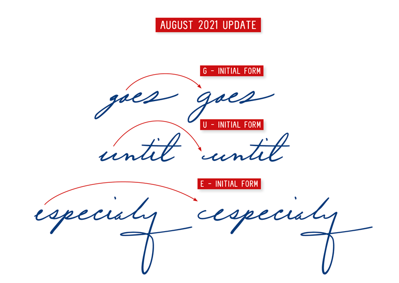
This update adds three new letterforms, lowercase initial letters e, g, and u.
The alphabet has uppercase and lowercase letters, but when looking at handwriting, one can notice that lowercase letters are drawn differently at the beginning or end of a word. These forms are called initial or final forms.
When looking at Dr. King’s handwriting, these initial and final forms are significant. To me, it even seems that there is a kind of joy in the swashes and intricate forms we find at the beginning and end of his handwritten words. That is why it is so important to me to bring these forms into the font. Then, as you type, the font automatically chooses the right letterform for you.
These changes may seem small, but it enriches the reader with a variety of forms. And I find this kind of complexity is very pleasing for the eye.
If this is not working on your computer, look at the tutorial from →Update #16 on activating Initial and Final Forms, it might help.
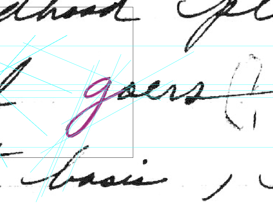
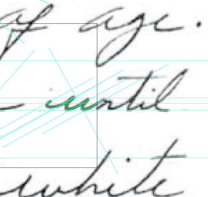
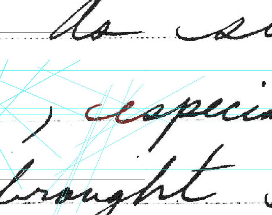
Here you see the new letters in the context of the original manuscripts “An Autobiography of Religious Development”, Page 5 and 11. (Click to enlarge)
Two ways to support the Martin Luther King font.
This project is very dear to me; I hope you enjoy the font. Without support, this project would not be possible! The more people support the project, the more time I can spend working on the font.
1. Spread the word.
Share this email or share a link to the project site: https://haraldgeisler.com/martin-luther-king-font with friends, family, and colleagues you think would be interested in the font.
I like to download…
2. Donate regularly to the font.
I will add one additional letter for each 100€ ($110, £90) donated monthly. The continuity will help me and the rhythm of the project.