There’s a new update available to the Martin Luther King Font. You can download the font from your account:
You are new? Download the font for free here:
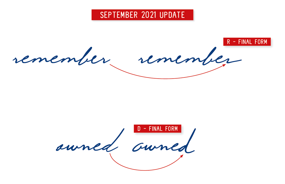
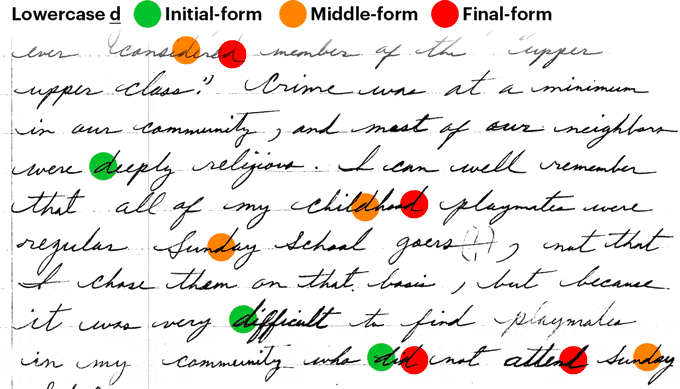
This update adds two new letterforms lowercase final form d and r.
The new version will show up in your font menu as “Martin Luther King 2021 September”. I recommend uninstalling older versions to keep your font menu organized.
Transparency is important. Please find a detailed spreadsheet with the total number of supporters and donations →here.
A big “Thank you.”
to everybody who supported the creation of the font this month. This update is possible because of the financial support of 22 people from around the world. I want to take some space to thank them:
J. Harris, Montgomery, Al 🇺🇸
J. Horton, North Turramurra, NSW 🇦🇺
N. Renner, New Britain, CT 🇺🇸
B. Desclee, Brussels 🇧🇪
K. Engelbrecht, Bern 🇨🇭
R. Wampler, Colorado Springs, CO 🇺🇸
D. Chamberlain, Benicia, CA 🇺🇸
H. de Wolf, Zaandijk 🇳🇱
K. Tilley, Linthicum Heights, MD 🇺🇸
C. Smith, Nedlands, WA 🇦🇺
J. Ford, New York, NY 🇺🇸
P. Herman, Bonsall, CA 🇺🇸
F. Chaplais, Ile de France 🇫🇷
J. Holze, Magdeburg, Saxony-Anhalt 🇩🇪
N. Wilson, Broken Arrow, OK 🇺🇸
T. Zwitserlood, Amsterdam, NH 🇳🇱
J. Wilson, Nashville, TN 🇺🇸
G. Sjölin, Örebro 🇸🇪
R. Lindsey, Grand Terrace, CA 🇺🇸
H. Colsman-Freyberger, Mannheim, Baden-Württemberg 🇩🇪
F. Engerer, Nürnberg, Bavaria 🇩🇪
H. Billetter, Kerpen, North Rhine-Westphalia 🇩🇪
Join the list of supporters:
Let’s talk fonts.
This update adds two new letters lowercase final form d and r.
The alphabet has uppercase and lowercase letters, but when looking at handwriting, one can notice that lowercase letters are drawn differently at the beginning or end of a word. These forms are called initial or final forms.
When looking at Dr. King’s handwriting, these initial and final forms are significant. To me, it even seems that there is a kind of joy in the swashes and intricate forms we find at the beginning and end of his handwritten words. That is why it is so important to me to bring these forms into the font. Then, as you type, the font automatically chooses the right letterform for you.
These changes may seem small, but it enriches the reader with a variety of forms. And I find this kind of complexity is very pleasing for the eye.
If this is not working on your computer, look at the tutorial from →Update #16 on activating Initial and Final Forms, it might help.
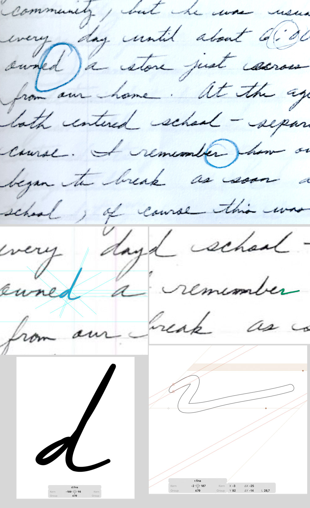
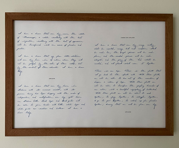
Here you see the new letters in the context of the original manuscripts “An Autobiography of Religious Development”, Page 11. (Click to enlarge)
The I have a dream speech (PDF) & Recommendations
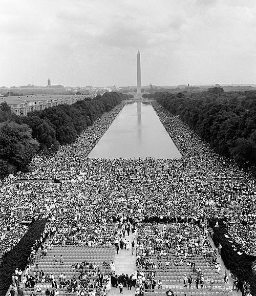
On this day in 1963, Martin Luther King Jr. gave his “I Have a Dream” speech in front of the Lincoln Memorial during the March on Washington.
This image shows the view from the Lincoln Memorial toward the Washington Monument on August 28, 1963.
In the description of the Martin Luther King Font, you can read: “My aim with these handwriting projects is to open the door to the content of an author through the aesthetic of handwriting, and the general interest for typography and fonts.” and: “We all know what his voice sounds like, but as a typographer I became curious: how did he prepare his speeches and organized his thoughts in writing, and what does Dr. King’s handwriting look like?“
From the beginning of this project, I noticed a difference between the historical figures of my other handwriting fonts. It is easy to find out what Einstein or Freud looked like, but usually, it is difficult to hear a person from the time before the Second World War. However, because Dr. King is often quoted in his voice, it was clear to me what he sounded like.
Choosing a handwriting font instead of regular fonts usually makes the reading longer. Just like it takes longer to listen to a person speak than to read a transcript. I asked myself how the reading experience would change if I read Dr. King’s “I have dream” speech set in his handwriting.
Said and done. Included with the font, you will find a PDF of the speech set in Dr. King’s handwriting. In the document, you will also find a link to an unabridged audio recording from NPR so that you can listen and read along.
I am curious to hear from you if this typographic experiment changed your reading experience. And as I set out in the beginning “opens the door to the content of an author.”
Personally, I enjoy the speech as part of the work on the project. with every update, I print out a page from the script and hang it in my studio. It is part looking and evaluating the script, part continuously encountering the content of an author.
From the beginning of this project, I noticed a difference between the historical figures of my other handwriting fonts. It is easy to find out what Einstein or Freud looked like, but usually, it is difficult to hear a person from the time before the Second World War. However, because Dr. King is often quoted in his voice, it was clear to me what he sounded like.
A recorded voice conveys tone, speed, rhythm, and timing. While thinking about how speed, rhythm, and tone affect the content of a speech, I remembered a moment in a calligraphy class that I took years ago. We discussed that in religious calligraphy, words would be written with a specific speed. Instead, speed has to be adjusted to the spiritual context of a phrase.
Choosing a handwriting font instead of regular fonts usually makes the reading longer. Just like it takes longer to listen to a person speak than to read a transcript. I asked myself how the reading experience would change if I read Dr. King’s “I have dream” speech set in his handwriting.
I am curious to hear from you if this typographic experiment changed your reading experience. And as I set out in the beginning “opens the door to the content of an author.”
Personally, I enjoy the speech as part of the work on the project. With every update, I print out a page from the script and hang it in my studio. It is part looking and evaluating the script, part continuously encountering the content of an author.
Recommendations:
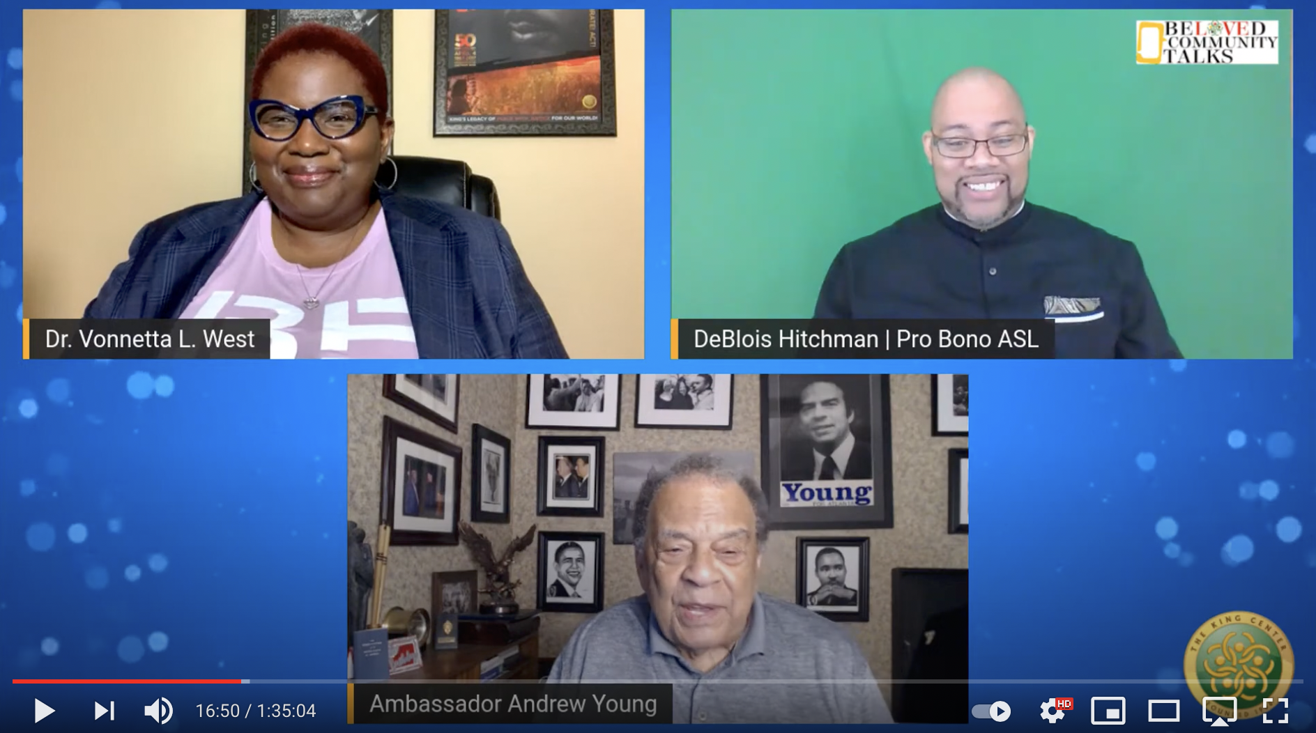
I like to recommend you to listen to Beloved Community Talks – Don’t Stop: March On For Justice broadcasted by The King Center yesterday. Featuring Andrew Young interviewed by Dr. Vonetta L. West about his recollection of the events that lead to the March on Washington.
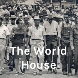
Secondly, I like to recommend https://kinginstitute.stanford.edu/world-house-podcast the World House podcast to you. The host Dr. Clayborne Carson is the director of the King Papers Project and Editor of Dr. King’s Autobiography. In Episode 13 he talks about his memories of the March and Dr. King’s speech.
Two ways to support the Martin Luther King font.
This project is very dear to me; I hope you enjoy the font. Without support, this project would not be possible! The more people support the project, the more time I can spend working on the font.
1. Spread the word.
Share this email or share a link to the project site: https://haraldgeisler.com/martin-luther-king-font with friends, family, and colleagues you think would be interested in the font.
I like to download…
2. Donate regularly to the font.
I will add one additional letter for each 100€ ($110, £90) donated monthly. The continuity will help me and the rhythm of the project.