Introduction
“…one-of-a-kind…”
Armin Vit, Quipsologies (former Speak Up) Vol.47 No.60, Austin, TX, US
“…stunning reinterpretation of a calendar is a masterful example of how a designer can completely flip a genre signifier on its head. Geisler reimagines calendars in order to change the way we visualize time, and in turn, redefines what it means to save the date.”
Mike McGregor, Kickstarter, NYC, US
“The more I look at this poster, the more in awe of it I am… it’s a complete revision of the way we construct time, month by month, day by day. To see a year laid that way is somehow frightening and optimistic.”
Elizabeth Kiefer, Editor at Fab, NYC, US
“This weird mosaic of keys is the perfect calendar for the writer or mechanical keyboard lover in your life”
John Brownlee, FastCo Design
“…staggering image…”
Erik Brandt, geotypografika.com, Minneapolis
“Loved Harald Geisler’s wall calendar made out of keyboard keys”
Maria Popova, Brainpickings.org @brainpicker
“…my heart went all a-flutter.”
Blair Pfander,Sundance Channel, Brooklyn, US

The Typographic Wall Calendar is a project I’ve been working on since 2009.
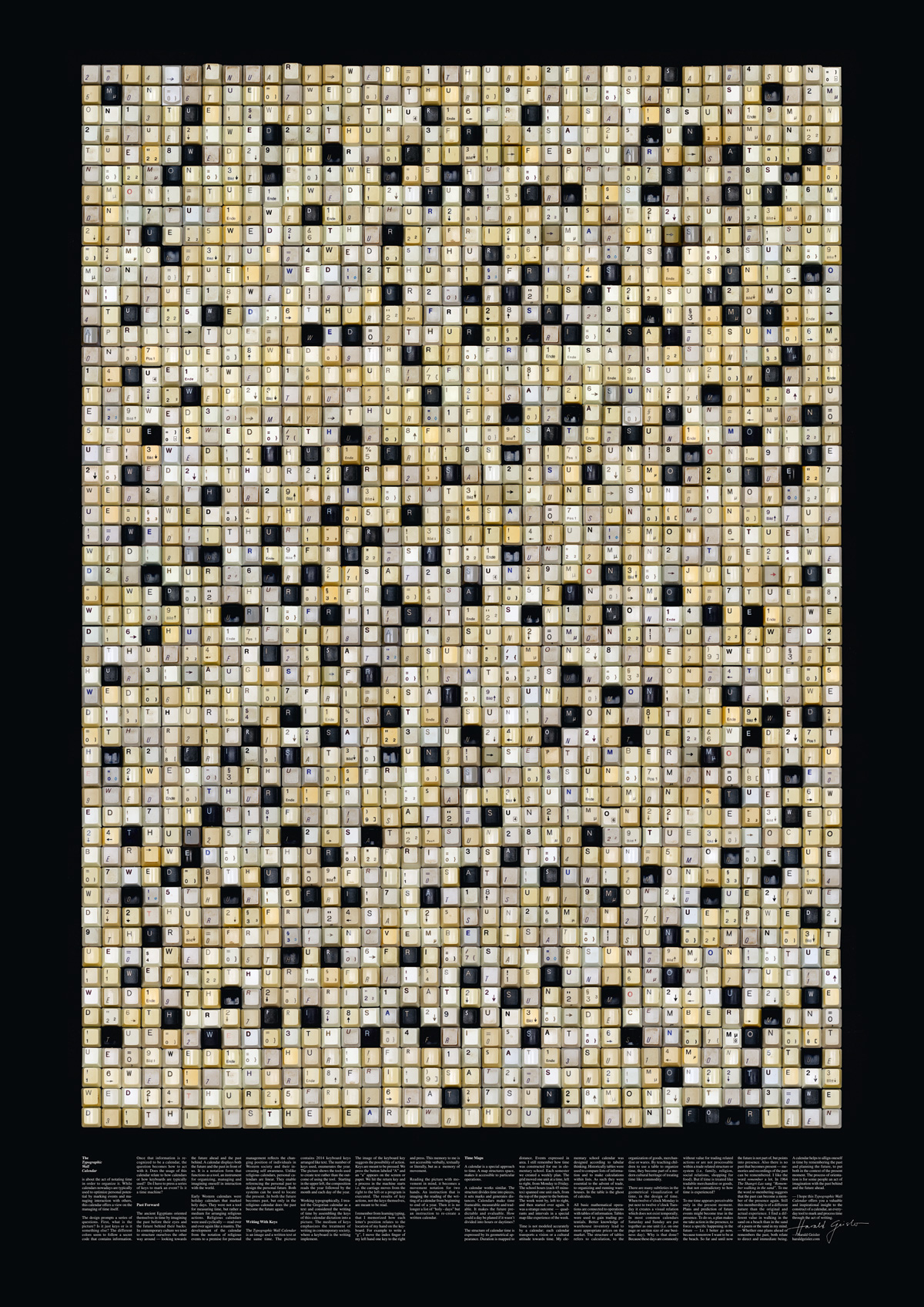
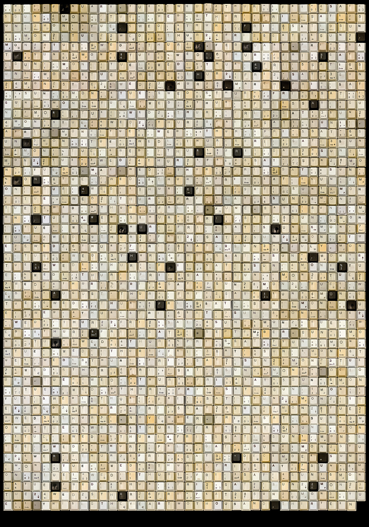
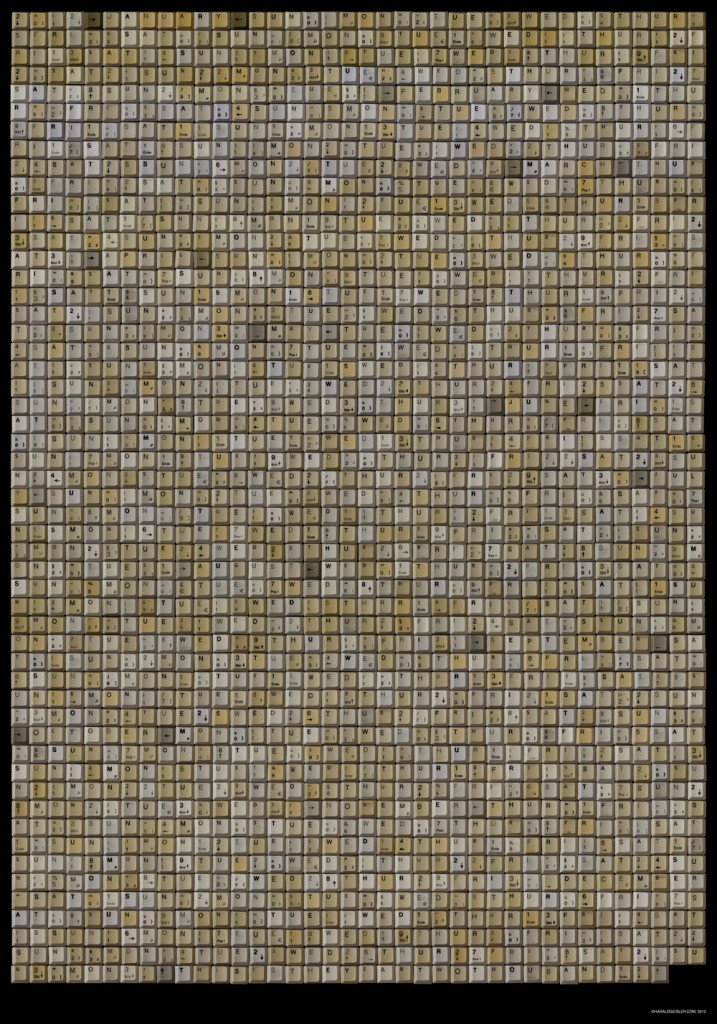
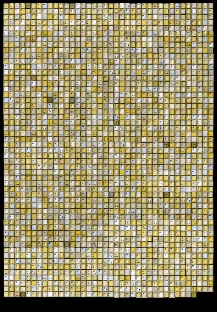
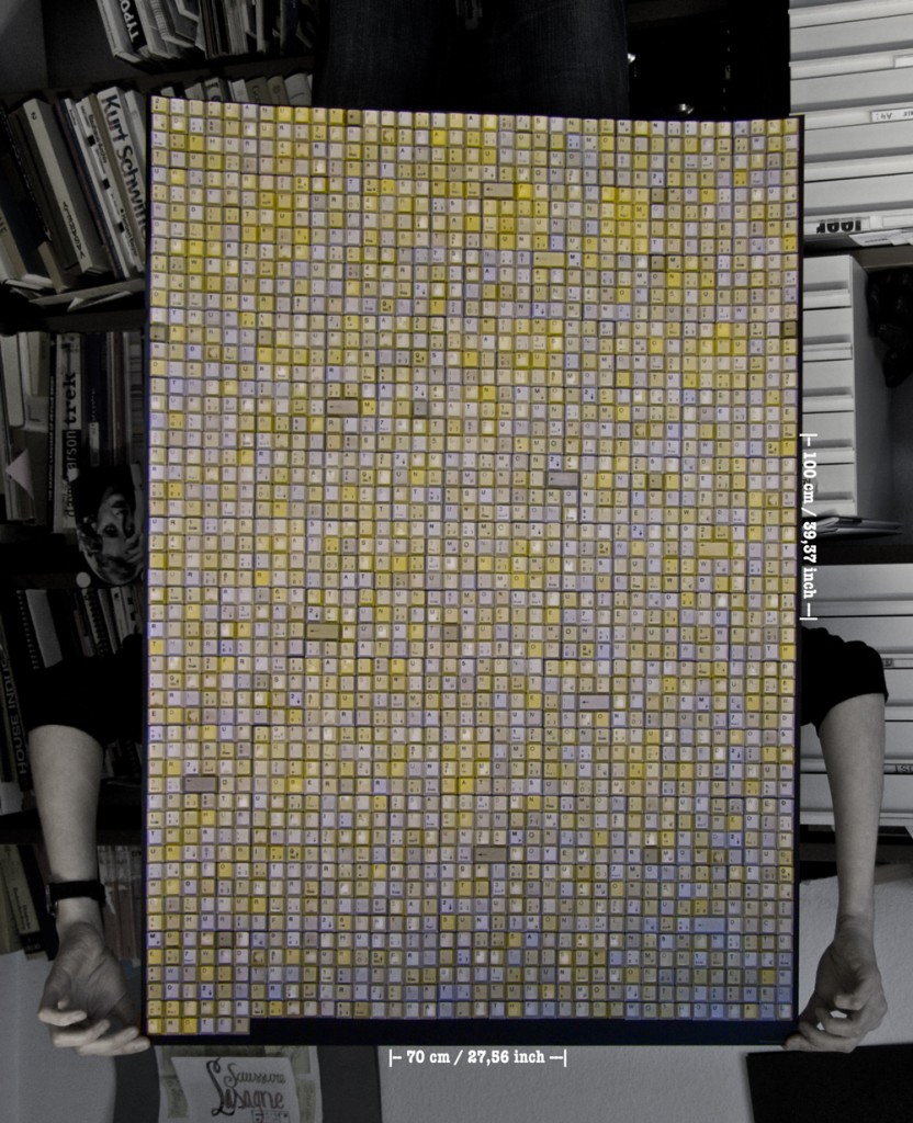
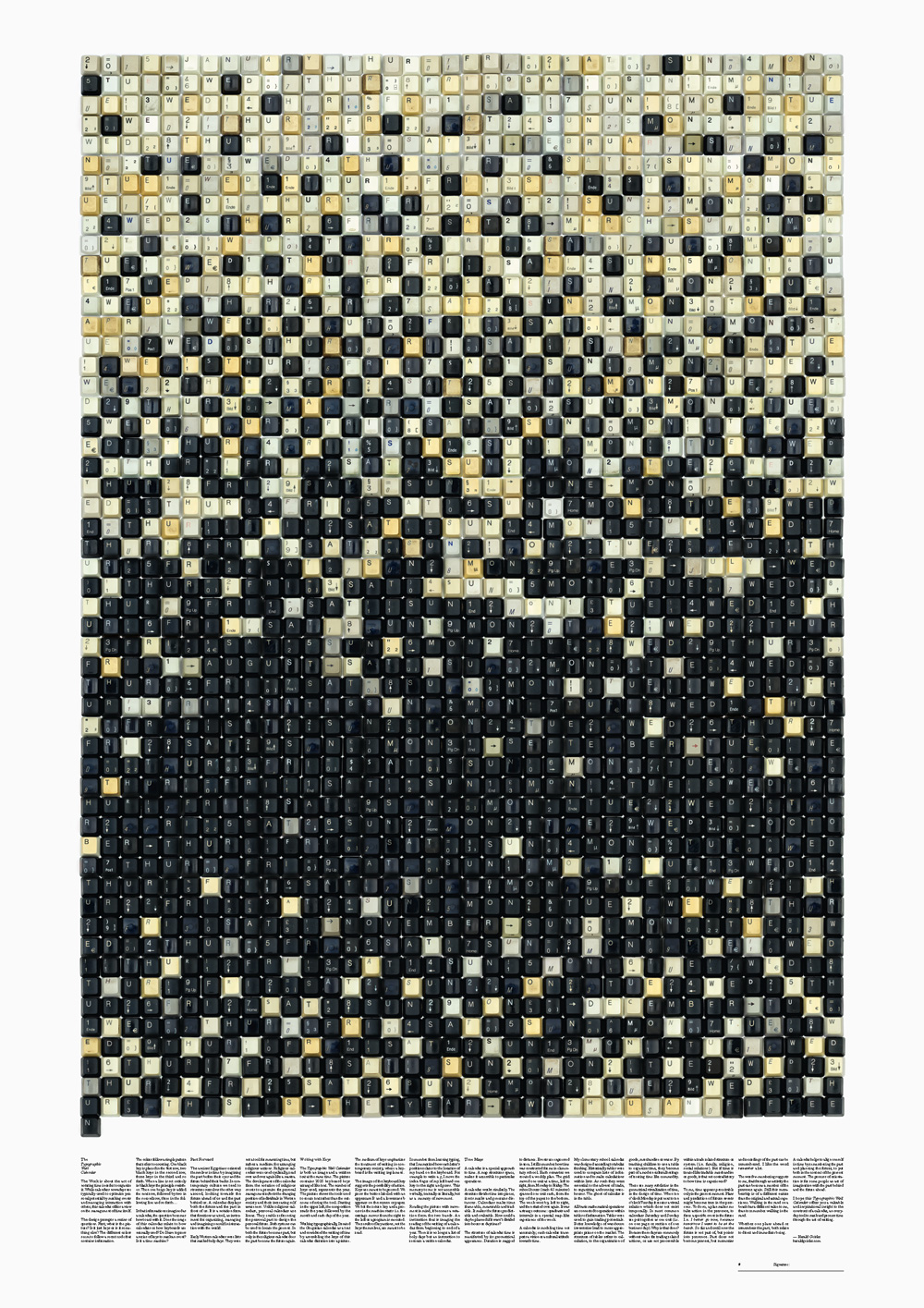
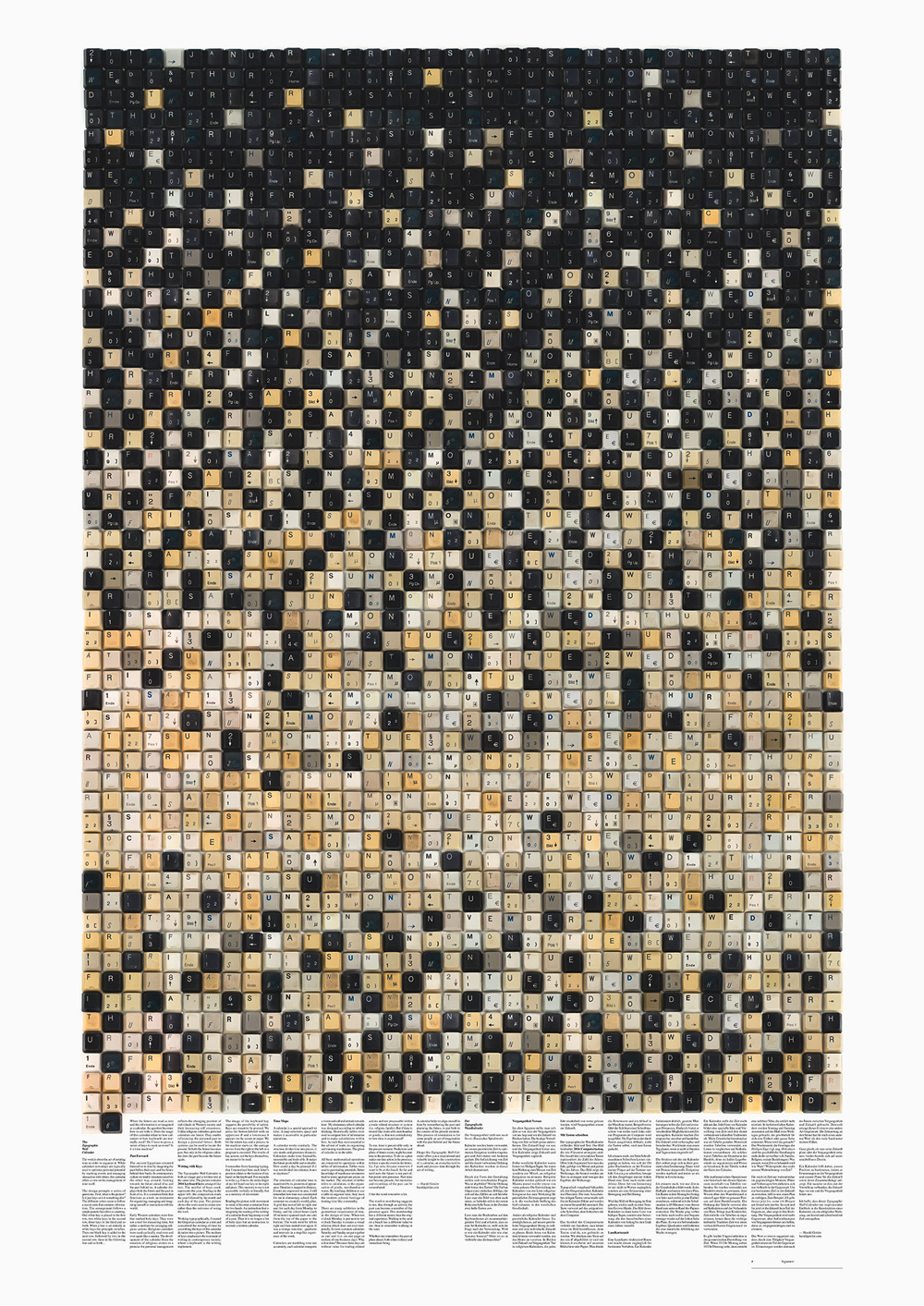
The calendar is made of exactly the number of used keyboard keys (for example, 2000 and 15) representing the year. If you read the keys from left to the right, they show each day of the year in sequence: JANUARY TUE 01 WED 02 THUR 03 etc. …like a string of all dates in the year. Months are marked by two arrow keys.
It started with a Daydream
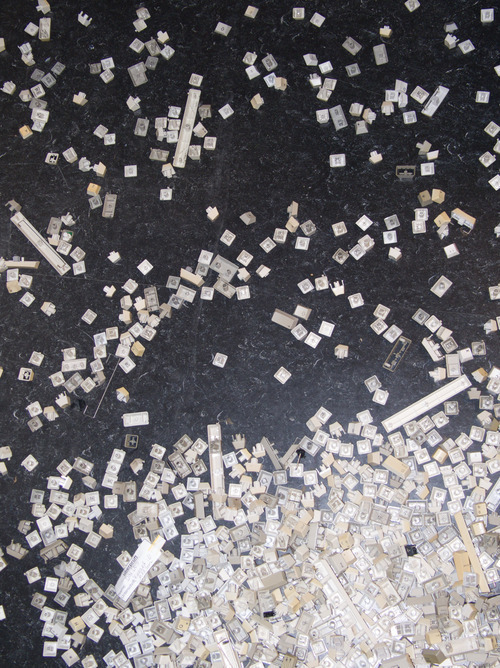
The initial idea for the Typographic Wall Calendar came from a daydream. In this dream, I imagined someone in a random office typing in front of a computer. The person writes letters, for example, to customers. On every letter the person writes the date, a repetitive part of the job. I imagined that as the person types, the pressed keys would (somehow) sum up or accumulate. Not only would the keys be counted, but also be collected, ordered, and stored. Over days and weeks, it would become a mountain of keys. This “mountain of keys” then became the Typographic Wall Calendar.
How is it made?
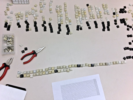
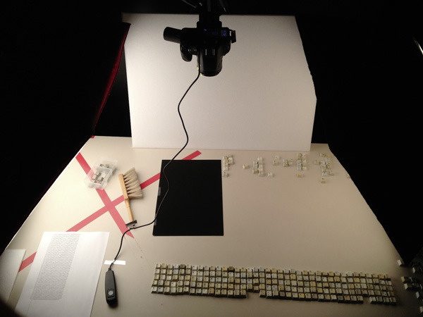
The calendar is made of exactly the number of used keyboard keys (for example, 2000 and 15) representing the year. The keys are arranged manually in a grid ( 38 x 53 + 1 = 2015 keys) to write out all days of the year 2015.
Then the composition is photographed with a special macro lens to avoid distortion. The print of the calendar reproduces the keys in their original size (1:1)
Do the colors of the keys follow a system?
Yes, each calendar has its own system. For example, the colors of the 2015 Calendar follow a simple pattern that refers to counting. One black key is placed in the first row, two black keys in the second row, three keys in the third, and so forth. When a line is set entirely in black keys, the principle switches. Then one beige key is added to the next row, followed by two in the second row, three in the following line, and so forth…
Overview of all years
2016
84cm x 118,8cm
2015
84cm x 118,8cm

Keyboard Typography
Nietzsche’s typewriter
In the beginning, I was focusing on the idea of writing the year from beginning to end as a continuous text and breaking up the common tabular structure of a calendar, which divides the year into columns (months) and rows (days).
I still find this a major point of the work. It shows clearly how dependent our imagination of time is on a tabular display and order.
I wanted to focus on the act of writing rather than the outcome, which would be rendered text. To show the act of writing, I choose to present all the keys necessary to write the year in front of you.
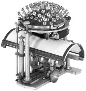
After starting to work with a typewriter philosopher, Friedrich Nietzsche said:
“Das Schreibzeug arbeitet mit an unseren Gedanken”
…the writing things collaborate on our thoughts. I like the term collaborate because it implies that we do not use the pen as a lifeless tool to express our thoughts. The pen itself is working actively on our thoughts. The contemporary writing implement is the computer keyboard on the screen or physically in front of us. If and how our writing tools work on our thoughts, I leave it to your imagination.
Different thoughts arise with this collection and the many keys in front of me. People around me complain about the loss of handwriting; filled with nostalgia, a friend buys a $500 Montblanc pen. But I also noticed that other people are talking with nostalgia for old keyboards. This article on Ars Technica is about the IBM Model M that was built in the 80s; in another article from PC World, the same device is praised as the world’s greatest keyboard. As a typographer, I noticed typographic aspects that I would like to draw your attention to.
The IBM Model M and the Macintosh Exception
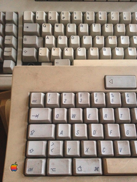
In the picture, you see an Apple Keyboard with an IBM Model M behind it, both are built in 1989.
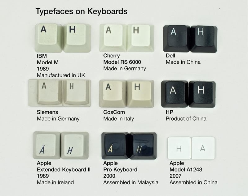
A small detail is the positioning of the letter. On all Personal Computer keyboards, letters are placed in the upper left on the key cap. The only exception is Macintosh keyboards. Apple placed the letter on the lower left until 2007 with the Apple Keyboard A1243.
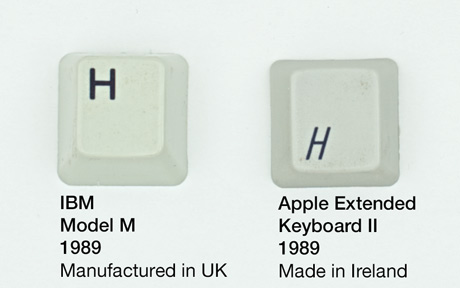
Apple decided for a rather dynamic italic condensed sans serif typeface, whereas most other keyboard manufacturers until today prefer an extended bold and sometimes rounded sans serif.
In 2007 Apple introduced their flat keyboards model A1243 which also placed the label in the center of the key with an Upright, rather airy geometric sans serif typeface.
To me, there is no argument for a design decision to place the label in the lower or the upper left. Once hands are placed on a keyboard, the keys become invisible but tangible. That is why the little nobs on the J and F are so important to me. I like the placement of the letter in the center; it makes the device less complex and reminds me of old typewriters, where the keys had round caps with beautiful slab serif letters on them.
Here is an overview of different keys with different Typefaces on them.
Major changes in society are reflected in keyboard design
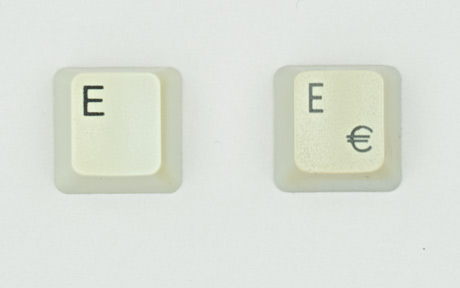
On the first day of January 2002, the Euro currency was introduced. After 1999 keyboard manufacturers started to print a € sign next to the E key. This makes it easy to spot the age of a European keyboard.
On Calendars
The
Typographic
Wall
Calendar
The work is about the act of notating time in order to organize it. While calendars nowadays are typically used to optimize personal potential by marking events and managing interaction with others, this calendar offers a view on the management of time itself.
The design prompts a series of questions. First, what is the picture? Is it just keys, or is it something else? The different colors seem to follow a secret code that contains information. The arrangement follows a simple pattern that refers to counting. One white key is placed in the first row, two white keys in the second row, three keys in the third, and so forth. When a line is set entirely in white keys, the principle switches. Then one black key is added to the next row, followed by two in the second row, three in the following line, and so forth…
When the letters are read as text, and the information is re-imagined as a calendar, the question becomes how to act with it. Does the usage of this calendar relate to how calendars or how keyboards are normally used? Do I have to press a series of keys to mark an event? Is it a time machine?
Past Forward
The ancient Egyptians oriented themselves in time by imagining the past before their eyes and the future behind their backs. In contemporary culture, we tend to structure ourselves the other way around, looking towards the future ahead of us and the past behind us. A calendar displays both the future and the past in front of us. It is a notation form that functions as a tool, an instrument for organizing, managing, and imagining oneself in interaction with the world.
Early Western calendars were lists that marked holy days. They were not a tool for measuring time but rather a medium for arranging religious actions. Religious calendars were used cyclically, read over and over again like a mantra. The development of the calendar from the notation of religious events to a premise for personal management reflects the changing position of individuals in Western society and their increasing self-awareness. Unlike religious calendars, personal calendars are linear. They enable referencing the personal past to design a personal future. Both systems can be used to locate the present. In both, the future becomes past, but only in the religious calendar does the past become the future again.
Writing with Keys
The Typographic Wall Calendar is both an image and a written text at the same time. The picture contains 2016 keyboard keys arranged like text. The number of keys used represents the year. Starting in the upper left, the composition reads the year followed by the month and each day of the year. The picture shows the tools used to create text rather than the outcome of using the tool.
Working typographically, I treated the Gregorian calendar as a text and considered the writing of time by assembling the keys of this calendar dictation into a picture. The medium of keys emphasizes the treatment of writing in contemporary society, where a keyboard is the writing implement.
The image of the keyboard key suggests the possibility of action. Keys are meant to be pressed. We press the button labeled with an uppercase B, and a lowercase b appears on the screen or paper. We hit the return key, and a process in the machine starts, i.e., the carriage moves from the right to the left, or a program is executed. The results of key actions, not the keys themselves, are meant to be read.
I remember from learning typing that I memorized how each letter’s position relates to the location of my hand on the keyboard. For example, to write a g, I move the index finger of my left hand one key to the right and press. This memory, to me, is not accessible verbally or literally but as a memory of movement.
Reading the picture with movement in mind, it becomes a notation form for two hands. An instruction that is imagining the reading of the writing of a calendar from the beginning to the end of a year. Then it is no longer a list of holy days but an instruction to recreate a written calendar.
Time Maps
A calendar is a special approach to time. A map structures space and makes it accessible to particular operations.
A calendar works similarly. The structure divides time into pieces, sets marks, and generates distances. Calendars make time frameable, measurable, and tradeable. It makes the future predictable and evaluable. How could a day be planned without being divided into minutes, hours, or daytimes?
Elementary School Time
The structure of calendar time is manifested by its geometrical appearance. Duration is mapped to distance. Events are expressed in area. I still remember how time was constructed for me in elementary school. Each semester we created a weekly plan. A grid that moved left to right, one unit for each day from Monday to Friday, and the school hours (each 45 minutes) spanned each unit from the top of the paper to the bottom. The week went by left to right and then started over again. It was a strange outcome: quadrants and intervals in a map-like experience of the week.
Calendars model time not accurately; each calendar transports a vision and cultural attitude towards time. My elementary school calendar was designed according to tabular thinking. Historically tables were used to compare lists of information and to make calculations within lists. As such they were essential to the advent of trade, to organizing and running warehouses. The ghost of calculus is in the table.
All basic mathematical operations are connected to operations within tables of information. Tables were used to gain trading potential. Better knowledge of warehouse inventories leads to more appropriate prices on the market. The structure of tables refers to calculation and the organization of goods, merchandise, or wares. Teaching children to use a table to organize time teaches them the modern cultural heritage of treating time like a commodity.
There are many subtleties in the geometrical visualization of time, in the design of the time. When ten o’clock Monday is put next to ten o’clock Tuesday, it creates a visual relation that does not exist temporally. In most common calendars, Saturday and Sunday are put together as one unit (i.e., on one page or section of one business day). Why is that done? Because these days are without value for trading-related actions and not processable within a trade-related structure or system (i.e., religion, family). But if time is treated like tradeable merchandise or goods, is that not contradictory to how time is experienced?
Sand Glass
To me, time is perceivable only in the present moment. Predictions and plans of future events might become true in the present. To do so, a plan makes me take action in the present to force a specific event in the future. I.e., I am going now because I want to be at the beach tomorrow. So far and until now, the future is not part of, but points into presence. Past does not become present, but memories and recordings of the past can be remembered.
I like the word remember a lot.
The word re-membering suggests to me that through an activity, the past can become a member of the present again. This membership has a different nature than the original experience. Walking in the sand on a beach has a different value to me than to remember walking in the sand.
Whether one remembers the past or plans ahead, both relate to direct and immediate being.
A calendar helps to align oneself in time by remembering the past and planning the future, to put both in the context of the present moment. This process of orientation is, for some people, an act of imagination with the past behind and the future ahead.
I hope this Typographic Wall Calendar offers you inspirational and valuable insight into the construction of a calendar, an everyday tool to mark and process time through the act of writing.
— Harald Geisler, 2016
Purchase
- Printed in 4 color offset
- Size of the calendar:
A0 84cm x 118,8cm (Edition 2014-2016)
or
B1 70 x 100 cm (Edition 2010 – 2013) - Item ships from Germany.
Fun Facts
An oversized New Years Card…
The project began in 2009 as a (very oversized) New Years’ card for my studio in Frankfurt, Germany. The response from friends and clients was overwhelming. People called to say they wanted to buy more or had already framed it.
Kickstarter
After producing the first edition in 2009 for 2010 on my own; 2010 the project became my very first Kickstarter campaign. The response was very positive. After a successful campaign with 205% funding, over 90 calendars were shipped to people all over the globe.
In 2010 the 2nd Edition of the Typographic Wall Calendar received overwhelming funding of $18,089 from 428 international Backers.
2012 (3rd Ed.), 2013 (4th Edition), 2014 (5th Edition), and 2015 (6th Edition was not financed through Kickstarter) but 2016 (7th Edition) were all successfully funded through Kickstarter.
Prizes!
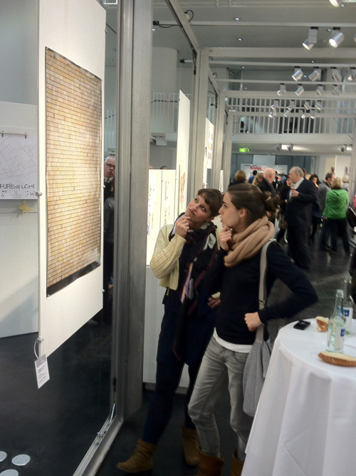
In January 2012, the Typographic Wall Calendar won the Gregor International Calendar Award in Stuttgart. Yes, there are awards, especially for calendars in Stuttgart.
In the catalog the Jury wrote: “In an intelligent and charming manner, this one-page calendar shows us how to get used to the new year. This is daily fodder for the gray cells and simultaneously poster-like and attractive”
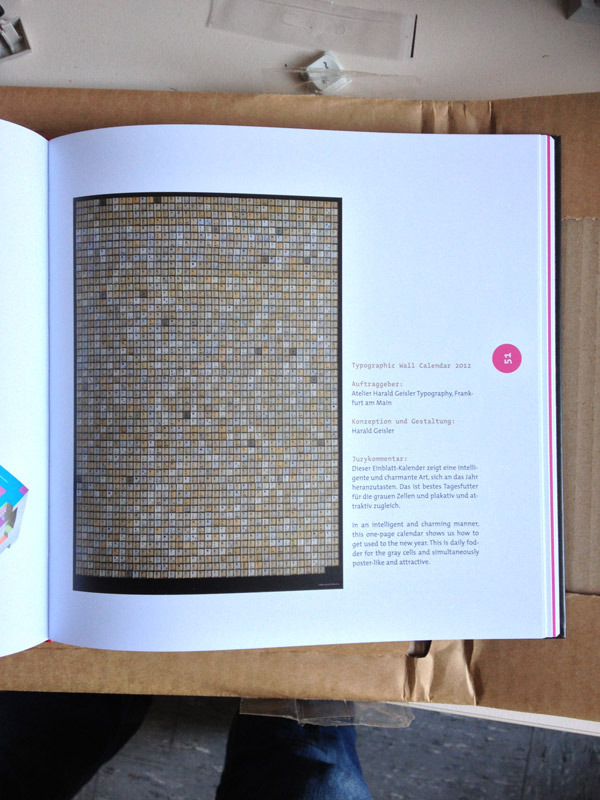
Italian Vogue
The Typographic Wall Calendar was an ‘Editors Pick’ at GQ Germany, featured on Fab.com and reviewed in ‘DESIGNER‘ an Art/Design magazine from Tel Aviv!
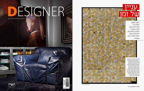
It was printed in NOVUM – World of Graphic Design (Issue 02/12) and featured two times on page-online.de
I always wanted my work to be featured in Italian Vogue. I never thought of being featured in a feminist and social justice magazine from Chicago!
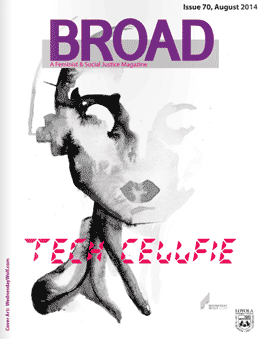
In Broad #70 “Tech Cell-fie” (p.38), between articles on the Future is Queer, Medicine and Gender, Cyborgs, GMOs, Fahrenheit 451, and quotes from Einstein (really!). Who wouldn’t want that?
Typotopografie is a kind of German Lonely Planet for typographers. Each issue focuses on one city and features typographic places and people in that area. The editors from Berlin and Munich contacted me and especially wanted to write about the Typographic Wall Calendar project. I am very happy to see the final piece printed:
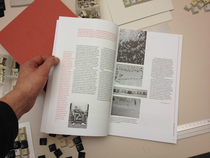
What do other people
say about the
Typographic Wall Calendar?
“Tipp”
— Fontblog.de, Jürgen Siebert, Berlin
“Empfehlung der Redaktion”
— GQ (Germany), Munich
”…pretty weird…”
— Smashing Magazine @smashingmag, Freiburg, Germany
“Typographic Wall Calendar by Harald Geisler doesn’t scream calendar but is a fun print for your wall with a gentle nod to the year.”
— Caroline Williamson, Design Milk, The Best 2013 Modern Calendars, US
“…simple, effective, straightforward, yet dizzying…”
— Xiaoli Li, Formatmag, Toronto, Canada
“Creative of the week”
— Gerrie Smits, The RAAKonteur #20, London
“…der minutiöse Wahnsinn, …(der) eher an J. Johns oder einen sehr disziplinierten J. Pollock erinnert als an deinen normalen Wandkalender.”
— Hans Schumacher, slanted.de, Berlin
“…unique DIY…”
— Abby Jenkins, Apartment Therapy Unpluggd, US
“…staggering image…”
— Erik Brandt, geotypografika.com, Minneapolis
“…thought intrigued…”
— Idealog Weekly, idealog.co.nz, New Zealand
“…This is calendar ART. This is art that is a CALENDAR…”
—km, Clerk & unwell, Chicago
“…ambitiøse…”
— Thomas Arendt, blog.makeyourmark.dk, Denmark
“…perfekte Tastenkombination für das kommende Jahr.”
— Publique, itspublique.de, Germany
Around the world
So far, the Typographic Wall Calendar has been shipped to 41 countries around the globe: Argentina, Australia, Austria, Belgium, Brazil, Canada, Croatia, Denmark, Estonia, Finland, France, Germany, Greece, Hong Kong, Iceland, India, Indonesia, Ireland, Israel, Italy, Japan, Korea, Liechtenstein, Luxembourg, Malaysia, Mexico, Netherlands, New Zealand, Norway, Portugal, Russia, Saudi Arabia, Singapore, South Africa, Spain, Sweden, Switzerland, Taiwan, Thailand, United Arab Emirates, United States of America.
