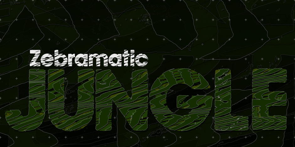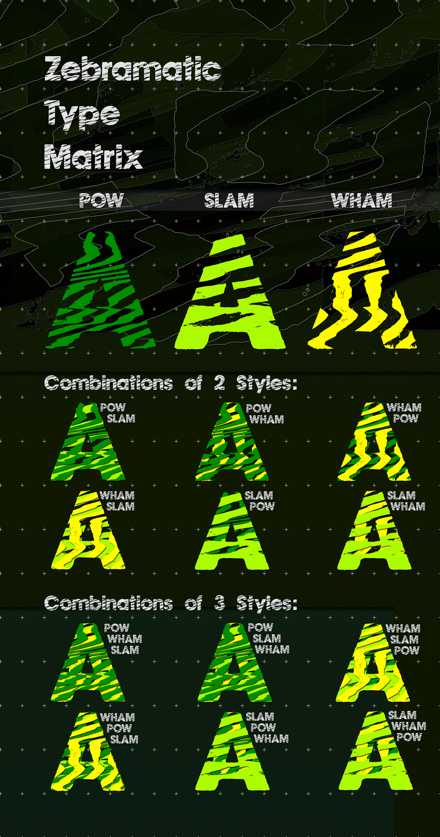
Zebramatic is a font for editorial design to create headlines and titles in eye-catching stripes. Constructed to offer flexible and a variety of graphical possibilities, the Zebramatic type is easy to use. The font is offered in three styles: POW, SLAM, and WHAM. These styles work both as ready-made fonts and as patterns to create unique, individualized types. The font design’s full potential is unleashed by layering glyphs from two or all three styles in different colors or shades.
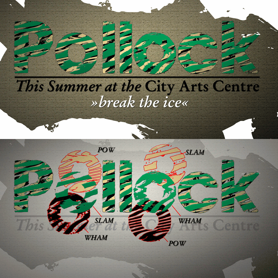
Working with the different styles, I was reminded of the late Jackson Pollock poured paintings—particularly, the documentation of his painting process by Hanz Namuth and Paul Falkernburg in the film Jackson Pollock 51. In Pollock’s pictures, the complex allure arises from how he layered the poured and dripped paint onto the canvas. Similar joyful experiences and exciting results emerge by layering the different styles of the Zebramatic type.
Texture
At the heart of the Design is Zebramatic’s unique texture. It is based on an analog distorted stripe pattern. The distortion is applied to a grade that makes the pattern complex but still consistent and legible. You can view some of the initial stripe patterns in the background of examples in the Gallery. Zebramatic POW, SLAM, and WHAM each offer a distinct pallet of stripes—a unique zebra hide. POW and WHAM use different distortions of the same line width. SLAM is cut from a wider pattern with thicker stripes. The letter cut and kerning is consistent throughout styles.

Design Concept
Attention-grabbing textured or weathered fonts are ideal for headlines, ads, magazines, and posters. In these situations, rugged individuality, letter flow, and outline features are magnified and exposed. Textured fonts also immediately raise the design questions of how to create alignment across a word and deal with repeated letters.
Zebramatic was conceived as an especially flexible font, one that could be used conveniently in a single style or by superimposing, interchanging, and layering styles to create a unique type. The different styles are completely interchangeable (identical metrics and kerning). This architecture allows the typographer to decide which form best fits the specific project.
Alignment and repetition were special concerns in the design process. The striped patterns in Zebramatic are carefully conceived to align horizontally but not to match. Matching patterns would create strong letter pairs that would “stick out” of the word. For example, take the problematic word “stuff.” If Zebramatic aligned alphabetically, the texture of S, T, and U would align perfectly. The repeated F is also a problem. Imagine a headline that says, »LOOK HERE.« If the letters OO and EE have copied »unique« glyphs – the headline suggests mass production, perhaps even that the designer does not care. Some OpenType features can work automatically around such disenchanting situations by accessing different glyphs from the extended glyph table. However, this automation is also repeated; the generated solutions become patterns themselves.
Flip and stack
To master the situation described above, Zebramatic offers a different programmatic practice. To eliminate alphabetic alignment, the letters in Zebramatic are developed individually. To avoid repetition, the designer can flip between the three styles (POW, SLAM, WHAM), providing three choices per glyph. Stacking layers in different sequences theoretically provides 27 (3*3*3) unique letterforms. The last variable to play with is color (i.e. red, blue, black).
The design is robust and convenient. The font is easily operated through the main font panel (vs. the hidden sub-sub menu for OpenType-related features). The process of accessing different glyphs is also applicable in programs that do not support OpenType extensively (i.e. Word or older Versions of Illustrator).
Purchase
If you are purchasing on behalf of a company, please select the size of your company (number of employees in total). For larger companies, please select multiples of 100 employees tier.
By purchasing this font you agree to Harald Geisler’s End User License Agreement (EULA), which can be viewed here.
The Fonts work on all Windows, Mac, and Linux computers, as well as mobile devices like iPhones and iPads.
Technical Specification
International
Zebramatic is ready for your international typographic safari. The font contains an international character set and additional symbols – useful in editorial and graphic design.
Zebramatic was featured on Typography Served: https://www.typographyserved.com/Gallery/Zebramatic-Type/574668

