With kind support from the Sigmund Freud Museum Vienna and the Freud Museum London.
For those who regret
The Wall Street Journal
what keyboards and touch screens
have done to their penmanship,
typographer Harald Geisler
has an answer:
Sigmund Freud.
Sigmund Freud was a neurologist who lived from 1856 to 1939. His research and studies led to the foundation of Psychoanalysis.
When I first saw Freud’s century-old letters, I was fascinated by the beauty of these historic manuscripts. It made me smile to imagine a person writing his or her shrink a letter set in Freud’s handwriting. I started to plan to create a font based on his manuscripts.
I contacted the Sigmund Freud Museum in Vienna and Freud Museum in London. To start the creation, I selected eight handwritten documents – This selection of specimens was my orientation during the design process. They were created between 1883 to 1938 and are of various characters, such as handwritten scientific papers, personal letters, notes, and a telegram.
A successful Kickstarter Campaign with over 1400 Backers enabled me to visit the Archive and study the original Manuscripts of Sigmund Freud. Here you can see the video for the Kickstarter Campaign:
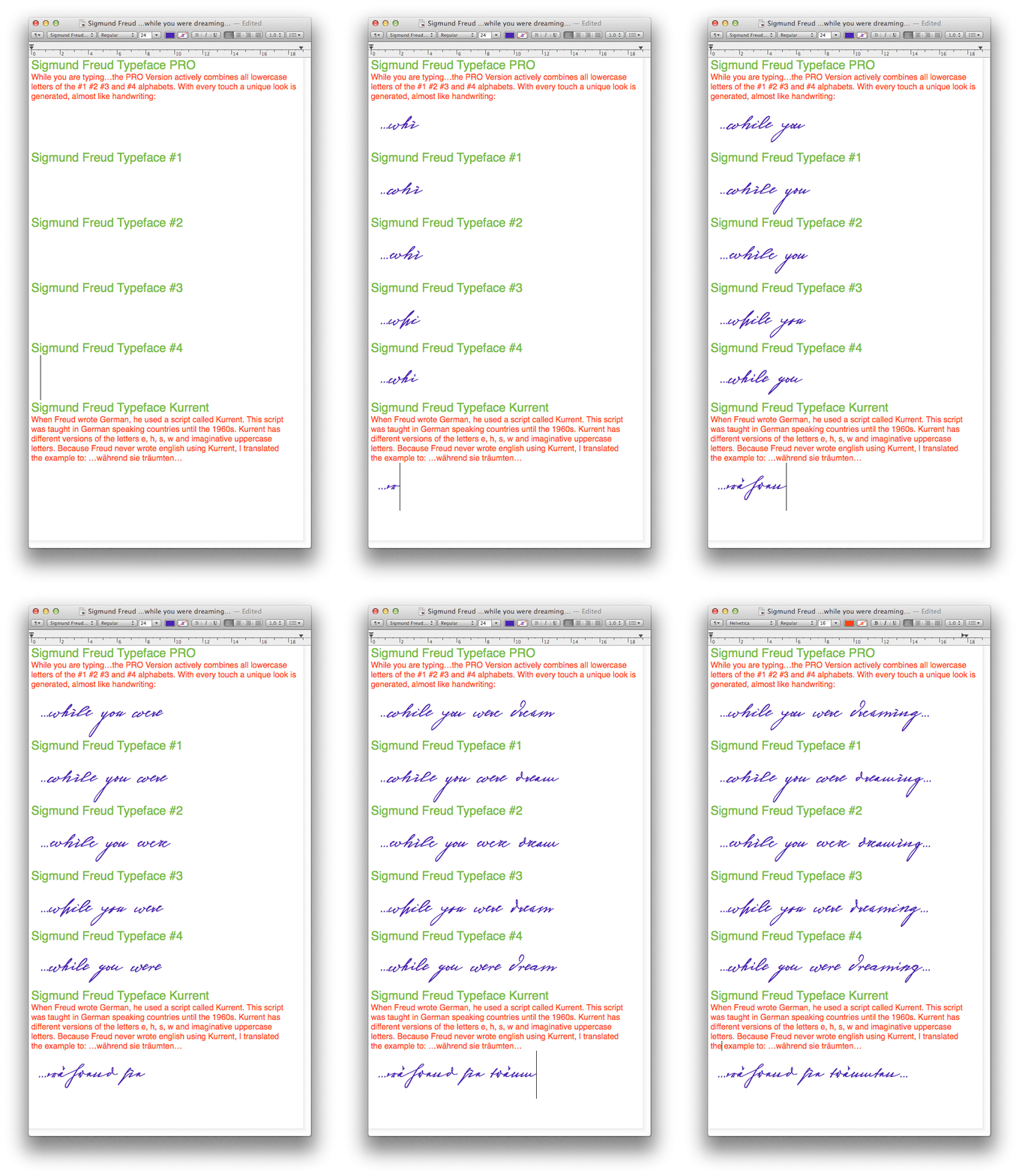
After months of development, I finished four alphabets based on Freud’s handwriting. Why four and not just one? When you write a text on your computer, every letter looks exactly the same. When you write with your hand, every letter looks a little different.
Different variations of each letter must be drawn and stored in the font to make the type look like handwriting. The font is then programmed to exchange letters while you are typing. This makes the rendered result on your screen or print look like handwriting.

The PRO Version contains all alphabets and alters the appearance of the written text while you are typing. The alternating mechanism works in certain applications i.e. Word 2010(or newer), Pages, TextEdit, InDesign, Illustrator… some applications like LibreOffice, OpenOffice do not support this feature. Maybe future versions will. Until then you can use the Sigmund Freud Font #1 , #2, #3 and #4 to access the different alphabets by hand.
The sixth file Kurrent renders German handwriting. Until the 1950’s a slightly different handwriting was taught in German speaking countries (Switzerland, Austria, Germany). This script had three significantly different letters (s,h,e,). This style of writing was called Kurrent. Most of Freud’s correspondence was written in German.
You will receive all six fonts (Sigmund Freud Typeface PRO, #1, #2, #3, #4 and Kurrent).
The Fonts (OpenType PostScript) work on all Windows, Mac and Linux Computers. The Sigmund Freud Typeface is international and features a wide range of accented letters to reach everyone in Sweden, France, Hungary and almost everywhere around the globe (Find a complete list below).
What do other people say about the project?
As a psychotherapist, I believe Freud contributed greatly to the thinking and understanding of Western society, and that this is an interesting way to draw attention to his work.
RB, Psychotherapist, San Francisco Bay Area, California
Purchase
Since 2025, the font is available through my new website dedicated to handwriting fonts: handwriting.digital.
The Fonts work on all Windows, Mac, and Linux computers, as well as mobile devices like iPhones and iPads.
Featured on:
Doctor, what does it mean if you dream of creating a font of Freud’s handwriting?
Ayun Halliday,
Open Culture
…geekily romantic, at once artistic and scientific
Edie Jarolim,
Freud’s Butcher
Wouldn’t you love to write a letter to your shrink using the Sigmund Freud typeface?
Dorothy Tan,
…sympathisch
Jürgen Siebert, Fontblog


