This is the 4th experimental font design added to the 2020 Font Collection.
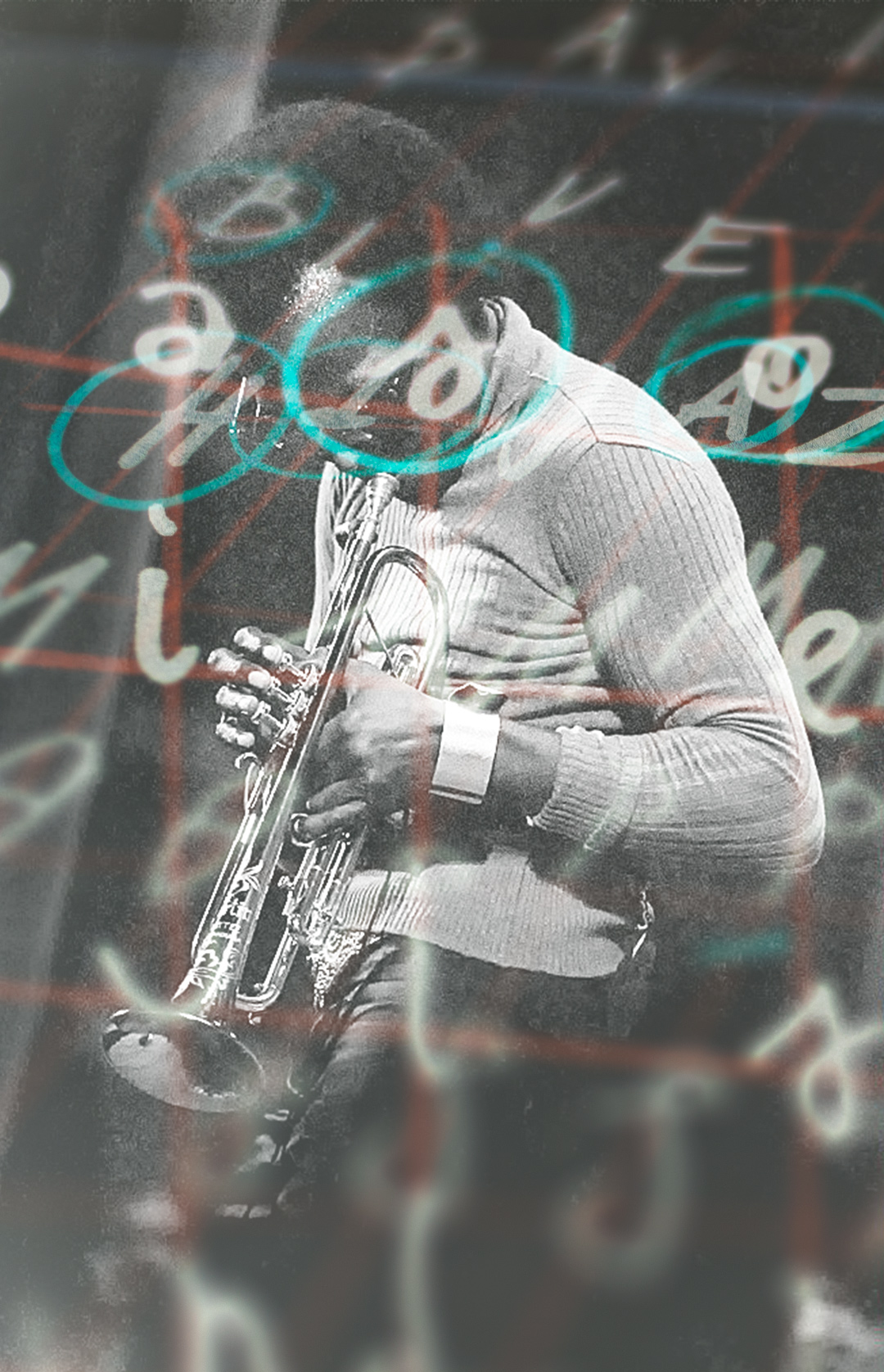
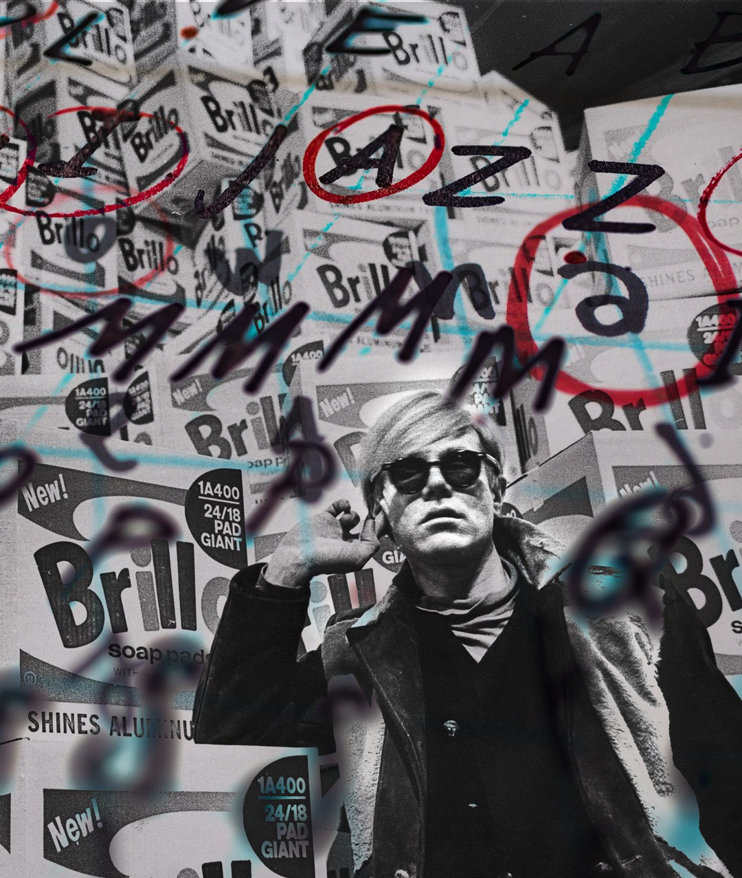
Imagine Andy Warhol and Miles Davis had a font. “So What” is inspired by a trick from Andy Warhol and a song from Miles Davis. To create the font, I locked myself in the studio listening to Davis’s “So What” on repeat for 8 hours. What emerged was a concept for a font drawn in four angles, with eight variations of each letter, and an algorithm programmed into the font to exchange the letters as you type. While you type the font creates a unique pattern melody for every word you type.
Warhol’s trick goes like this:
Sometimes people let the same problem make them miserable for years when they could just say: So what.
“My mother didn’t love me.” So what.
“My husband won’t ball me.” So what.
“I’m a success, but I’m still alone.” So what.I don’t know how I made it through all the years before I learned how to do that trick. It took a long time for me to learn it, but once you do, you never forget.
Andy Warhol, →The Philosophy of Andy Warhol, 1975
A & B → “So what” is a rhythmical study
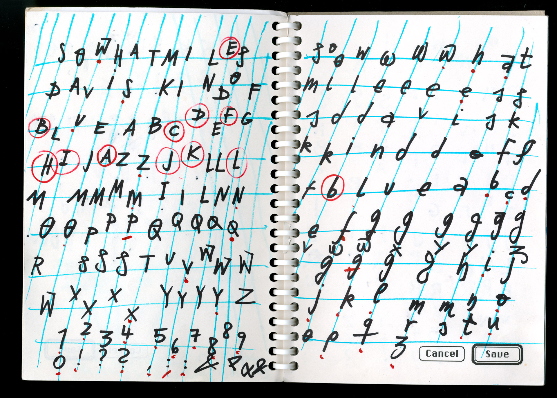
The initial idea is that letters have a characteristic angle (A) and an intuitive distance to the baseline (B). Listening to Davis’ music, I would go across the page and intuitively sketch an angled grid (A) to accompany the musical structure. Then I would write, “SO WHAT MILES DAVIS KIND OF BLUE” and repeat every letter until I feel that the “concept” or style of the letter would match the music, angle, and general feeling of the idea as a whole—followed by all uppercase letters, numbers, and signs. On the next page, I continue in the same way with lowercase letters. Afterwards, I mark letters that feel right with a circle and letters that have potential with a dot.
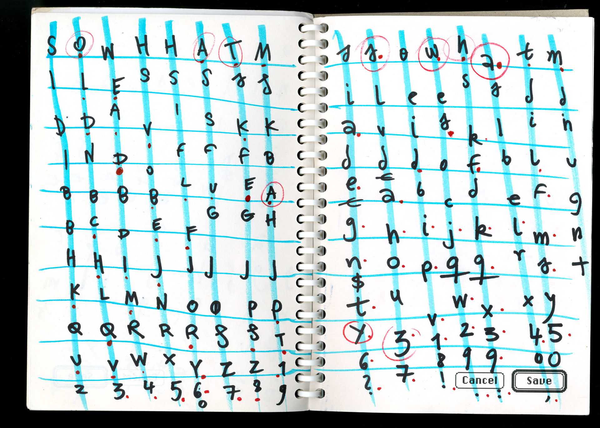
The words concept and style only loosely describe what is happening while I am drawing. I make decisions based on a combination of many qualities. Specifically, I like to mention the letter’s movement path: the movement to create a letter. It is essential for me that a movement’s feeling comes together with all the letters written before and relates to the basic movement idea of a letter.
The creation is an unfolding process and not a vision that I just need to get out of my head into the font. Sometimes, I have an idea for a letter’s movement, but most of the time, I watch (with surprise) what my hand is doing.
How are the letters digitized?
I care a lot about maintaining the intuitive quality in the transfer from paper to screen. Written with a felt pen, I had no significant, thick/thin contrasts to transfer. What I care about the most is capturing the movement correctly. Whereas the creation process is fast and filled with excitement, the transfer to the screen is meticulous. Here is an example:
Detour: Cage
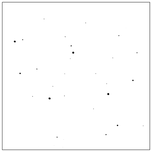
Regarding the distance to the baseline(B), I ask myself if the writing movement should happen on, above, or below the line. As I wrote this description, I thought of a music notation from John Cage. The composition was a gift to the pianist David Tudor on his Birthday in 1958. In the description, Cage writes:
The 5 lines are lowest frequency, simplest overtone structure, greatest amplitude, lease duration, and earliest occurrence within a decided-upon time.
Perpendiculars from points to lines give distances to be measured or simply observed.
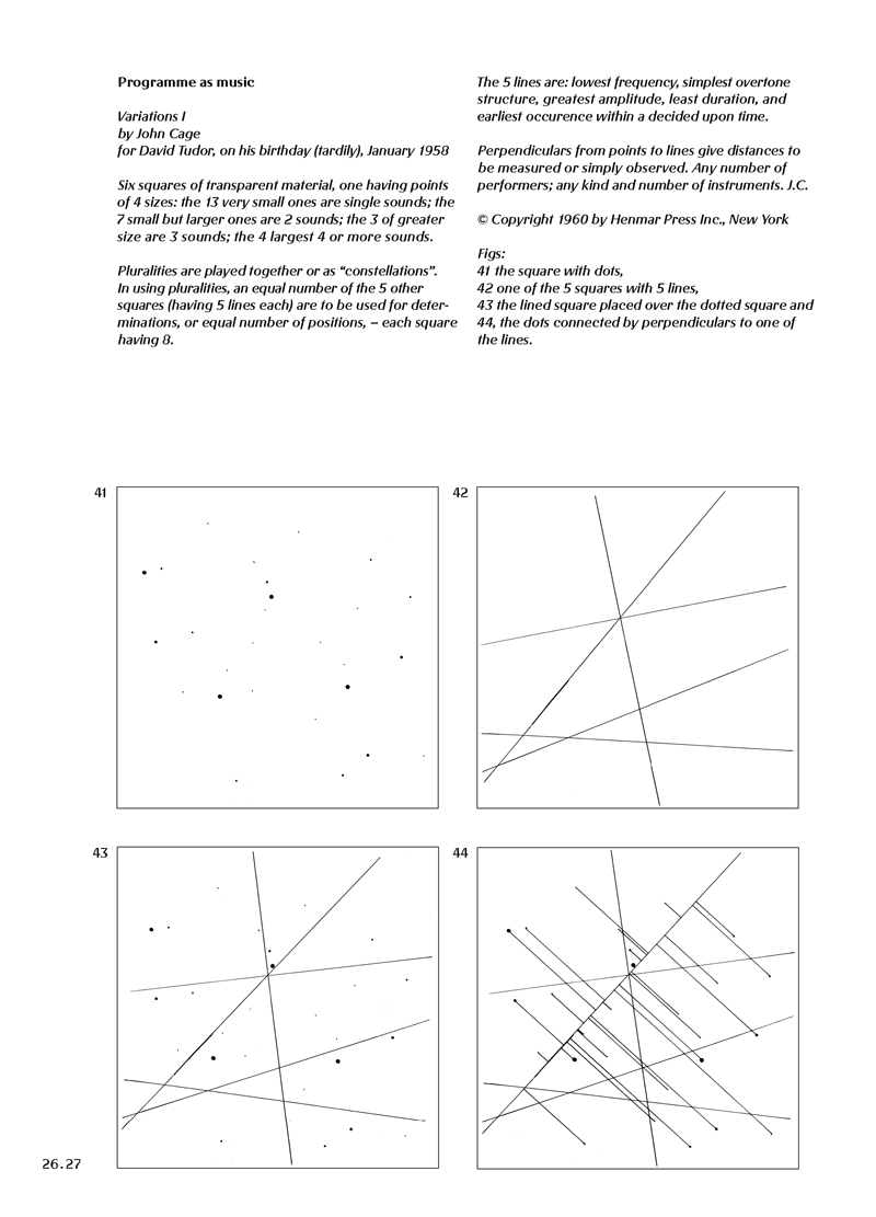
The work is one of my favorite pages of “Designing Programmes,” an essay collection by swiss typographer Karl Gerstner. I had the honor of recreating the book in 2007 together with the author. No wonder some of the images stuck in my mind. I recommend having a look at the book. The printed version has sold out, and I decided to offer the digital edition for free here: desiginingprogrammes.com.
I like the work because the reader’s interpretation has such an open and prominent place. Cage’s Notation deals with reading sound. How could this be reflected in the reading text?
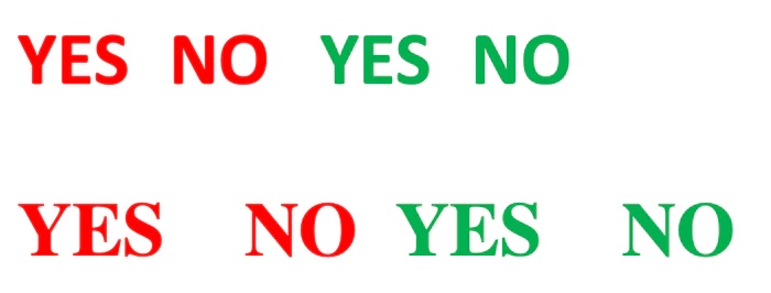
Let us assume for a moment that a text, or rather the smaller unit, a word, can be changed just by altering its appearance. A simple example would be color. Looking at the image below, which of the following says more or less yes or no to you?
Now, color is a convenient example. Looking at distances and their use in writing is a bit more complicated.
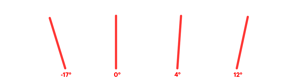
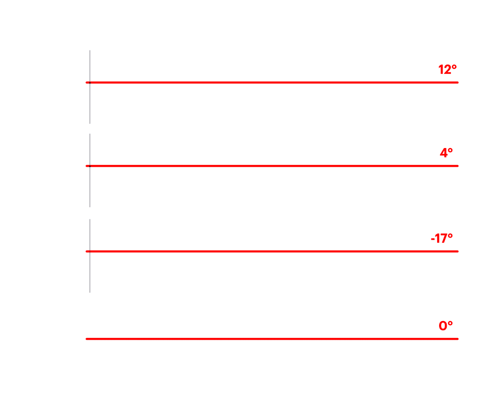
Let us examine how spaces are handled in the font “So what”. The four variants have four different angles, and each letter has an individual distance to the baseline.
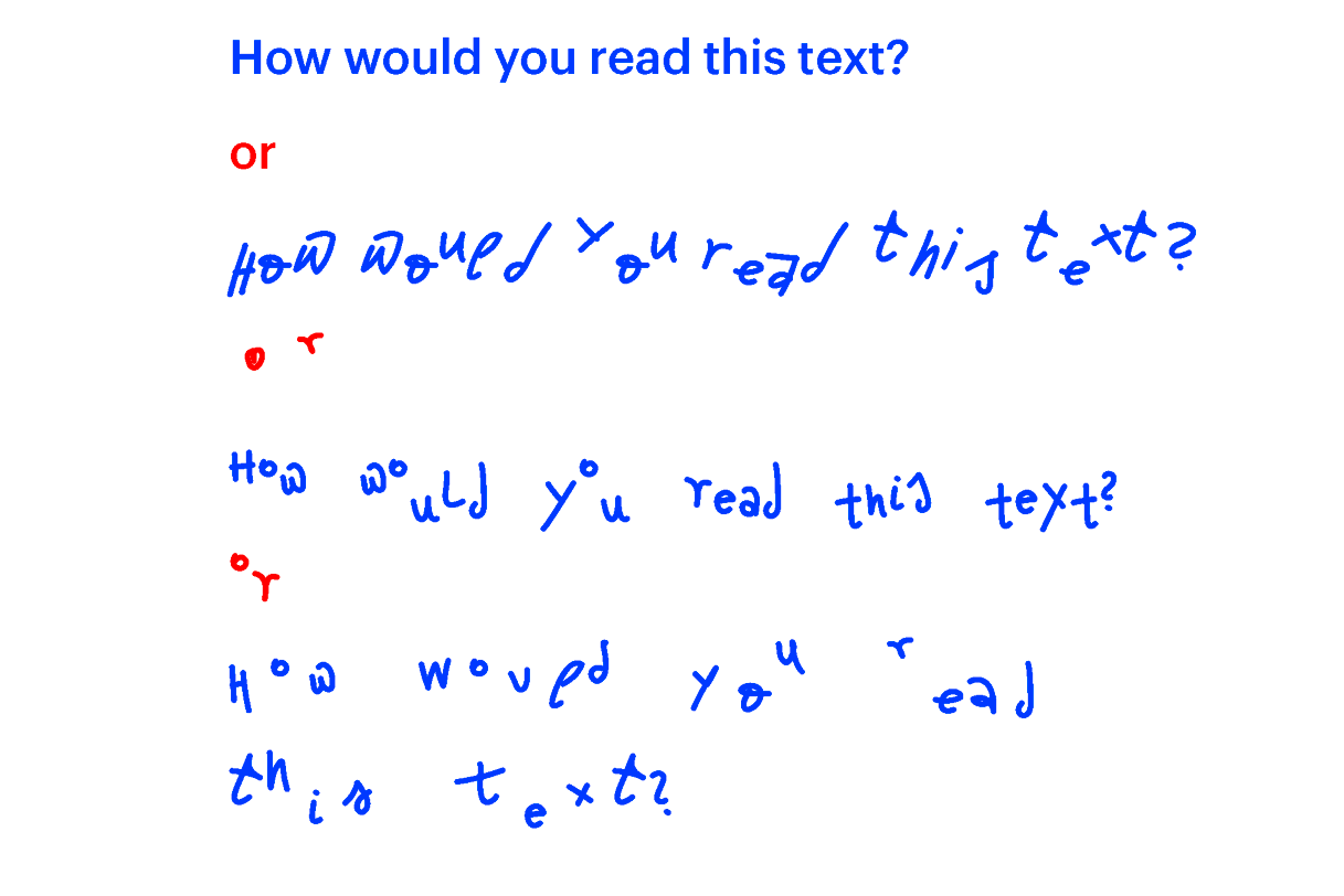
Looking at the distance of a letter to the baseline, what could be the effect on reading a text?
The first effect I notice is that I am playfully stretching the pronunciation when I read the text. My pronunciation reminds me of physical feelings, like being on a rollercoaster, riding the bike very fast, or dancing. These feelings can be exciting, exhausting and enlivening. A quote from typographer Wolfgang Weingart comes to mind: “Of what use is readability if there is nothing to excite us to take notice of a text.”
Cage’s work consists of a doted square and a square with lines placed on top of each other. There are different versions of each square that all fit together. The musician reads the squares by relating the marked positions and relating them to each other. And to make things even more complex, you can rotate each square. So we have a manifold of possible information.
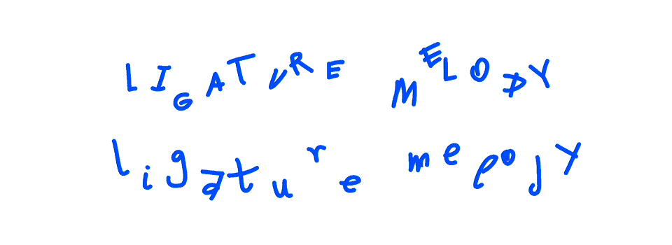
A similar principle applies to the “So what” font. I call it “ligature Melodies”,, and you can create your personal melody. But first, let me show you the…
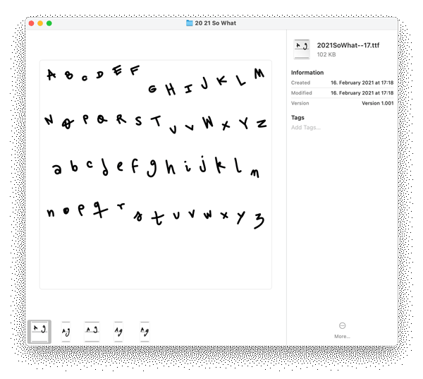
The five font files.
There are four variations of each letter (-17°, 0°, 4°, 12°). There is no strict separation between lower case and uppercase letters (A, a), so you can choose eight variations in some cases.
The variations or font styles are labelled referencing the angles.
You can combine the styles manually as you type, or you can use…
The fifth font: Andy and Miles.
Here is where the fun happens. I programmed different algorithms to combine different styles. The program is activated as you type. It picks one letter from the alphabet 4°, and as you type changes it to the same letter from -17°, with the next keystroke, the letter will be changed to 0° and so forth.
Ligature Melodies
This array -17°, 4°, 0°, 12° can be described as a melody. As you type, it will be that melody throughout your text. I stored different tunes in the Andy and Miles style. Access them through the advanced Font menu. The features are called Standard Ligatures, Discretionary Ligatures, and Contextual Ligatures.
The melody of Discretionary Ligatures
4°, -17°, 0°, 12°
The theme of Contextual Alternates
-17°, 12°, 4°, 0°
The tune of Standard Ligatures
4°, 0°, -17°, 12°
Here you see an example video of how to access them in Word:
Here is an example of how to apply the different melodies stored in the font:
What is the value of having all that in a font? Smile.
While explaining the research, thoughts, and experiments that led to this font, I asked myself: what is the value of these features? What is the importance of having a melody expressed in space between the letter and the baseline stored in a font design?
I think there is value in questioning and experimenting with the way one does everyday activities like writing. Experimenting has an element of learning in it. What would be the lesson learned from this font? This brings me to the question of how to judge or value a piece of art, a design, or a creation.
Studying typography and design, I learned different techniques and systems to ensure and measure the quality of a composition. Or how to find dissonances, the parts that don’t fit. Many of them are relatively simple and tied to the way our brain works and processes information. In my practice over the years, I found principles to measure if a design works or not or if it is good or not. They are not sentences that I frame and hang on the wall. I have these principles in my mind, which leads to forgetting them from time to time. But these principles always come back to me. While working on “so what,” it was a body reaction principle one can’t deny: laughing.
When a piece makes me chuckle and smile, I know this is on to something. It doesn’t happen very often that I chuckle to myself using a font. This one certainly made me smile and even laugh sometimes.
And maybe that is one of the many lessons that I took from this experimental creation: Fonts can make you smile while typing.
I hope you use the font with curiosity, and when you chuckle now and then while typing, that would make me very happy.
This is an experimental font added to the 2020 Font Collection.