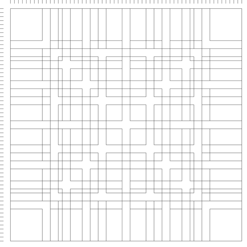
The “mobile grid” in the economic magazine Capital from 1962 represents a unique approach to editorial design. It was developed by Gerstner with Felix Berman. I remember being mesmerized by some very small reproductions of this work in Eye #43, in a review by Richard Hollis. The mobile grid drew my attention and interest towards Gerstner’s work, which later led to the publication of “Designing Programmes.”

In Designing Programmes, Gerstner writes “…if the grid is considered as a proportional regulator, a system, it is a program par excellence. … The typographic grid is a proportional regulator for composition, tables, pictures, etc. It is a formal programme to accommodate x unknown items. The difficulty is: to find the balance, the maximum of conformity to a rule with the maximum of freedom. Or: the maximum of constants with the greatest possible variability.” (p.16)


Here are some facts about Capital, published in May 1962:
- The typeface used on the title is the same as that used in the title of the first edition of Karl Marx’s “Das Kapital.” Which you can see in the Movie at 0:55 or here at Christie’s:

- Advertisers had the opportunity to purchase pages, but Gerstner and his team meticulously crafted the ad’s design, ensuring that every aspect of the magazine was on point.
- The editor’s motto for the magazine was to explain the economy in a humane, the humane in an economic way.
- The first edition had a print run of 10,000 copies and was available exclusively by subscription.


The results of editorial design (or typography) are never flat
The video documents the magazine being leafed through from the first to the last page. This approach emphasizes not only the design highlights but also the often overlooked pages, such as tables of contents and advertisements, which were also crafted with great care. It shows how the pages present themselves, which is never flat, and the authentic manner in which a reader interacts with the magazine, highlighting “reading time” as an essential dimension of typography.


The results of editorial design (or typography) are never flat; they bulge in the reader’s hand and towards the binding. Sometimes, the binding is so tight that it is impossible to open a print fully. Further, a publication is always touched with the fingers to turn the pages and sometimes held in one hand for an entire sitting. Often, reproductions of exemplary typography in books are shown flat, focusing on highlights and ignoring the intricacies of reading. However, the schematical and example-like illustrations of the mobile grid can introduce you to the playfulness of the concept. While a video cannot convey the touch of the paper and its weight, it gives an idea of its proportions to a hand. I hope the two together will give you a more informed impression of the work.
This issue of Capital from 1962, featured in the video, is also available for purchase. This edition is in mint condition, having been stored in Olivetti Frankfurt’s Marketing Archive. When Olivetti left Frankfurt, the edition fell into private hands and was then sold to me in ca. 2022.
Today is making this printed object old.