-
Programme entwerfen – Karl Gerstner
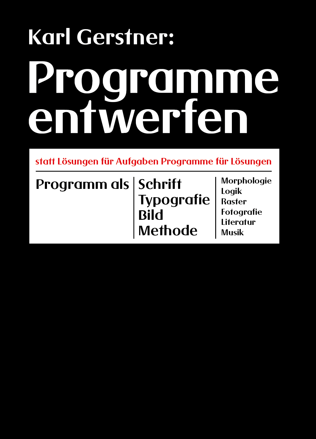
Find the English edition →here. Version française →ici. Wichtige Bücher haben oft nur ein kurzes Leben. Sie können vielleicht ein unerforschtes Gebiet beleuchten oder für kurze Zeit das Interesse auf sich ziehen, doch dann verschwinden sie auf einem staubigen Bücherbord. Einige wenige aber überdauern. Auf sie wird verwiesen, sie werden von Generation zu Generation weiter…
Categories: Books -

Designing Programmes – Karl Gerstner
Die deutschsprachige Version finden Sie →hier. Version française →ici. Some important books have only a brief life. They may light up an unexplored area or catch a rising tide of interest before they disappear onto dusty shelves. A few others last, are referred to and recommended by one generation to another. Designing Programmes is one…
Categories: Books -

Magnolia 1 & 2
I believe it was a Magnolia Liliiflora, it was about 11.5ft / 3,5m and profusely blossoming. My parents used to have this tree in front of their house. At one point, it was decided that the tree had to go because of a gas pipe that was below his roots, and I was asked to…
Categories: Print -

Dear Roozen A & B
“We are dying. We think we are not. This is a good argument for giving up thinking. Spend one night each week, in candlelight.” from Deborah Hay, “My Body, The Buddhist”, 2013 Details, click to enlarge. Specifications: “Roozen” is the old Dutch word for roses. Dutch still-life painting was always an inspiration to me, an…
Categories: Print -
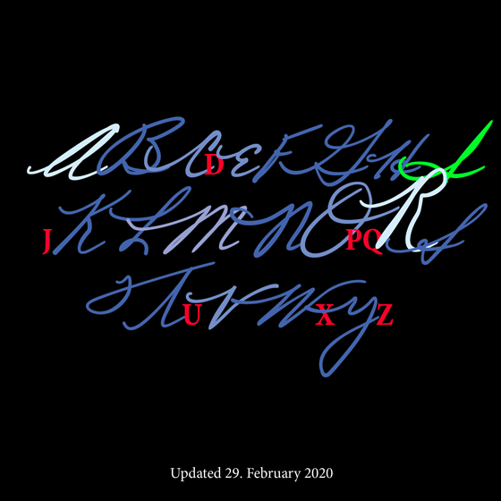
Martin Luther King font
Creating the Martin Luther King jr. Handwriting Font Letter by Letter. What does Dr. King’s handwriting look like? The civil rights activist and minister’s speeches and actions resonated around the world and continue to inspire generations today. We all know what his voice sounds like, but as a typographer, I became curious: how did he…
Categories: Fonts -
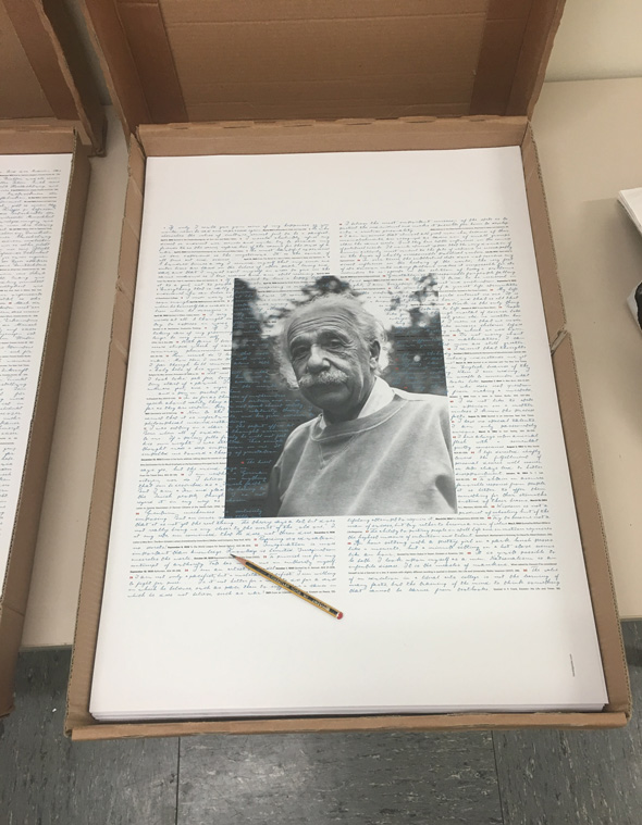
100 quotes from Albert Einstein – Poster
In 2017 I created a font based on Albert Einstein’s handwriting. Here I like to share with you a project that I created with the font: a set of four posters with 100 quotes from Einstein. Quotes can give an inspiring and entertaining view into a person’s life. Each is printed in the original size…
Categories: Print -
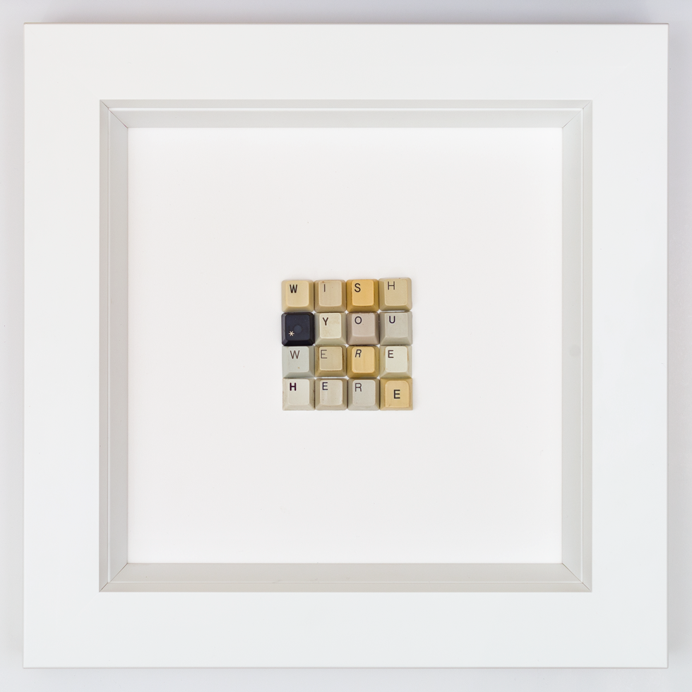
WISH YOU WERE HERE
WISH YOU WERE HERE Objectcreated in 2018signed on the backside Framed 35x35x4.5cm
Categories: typographic objects -
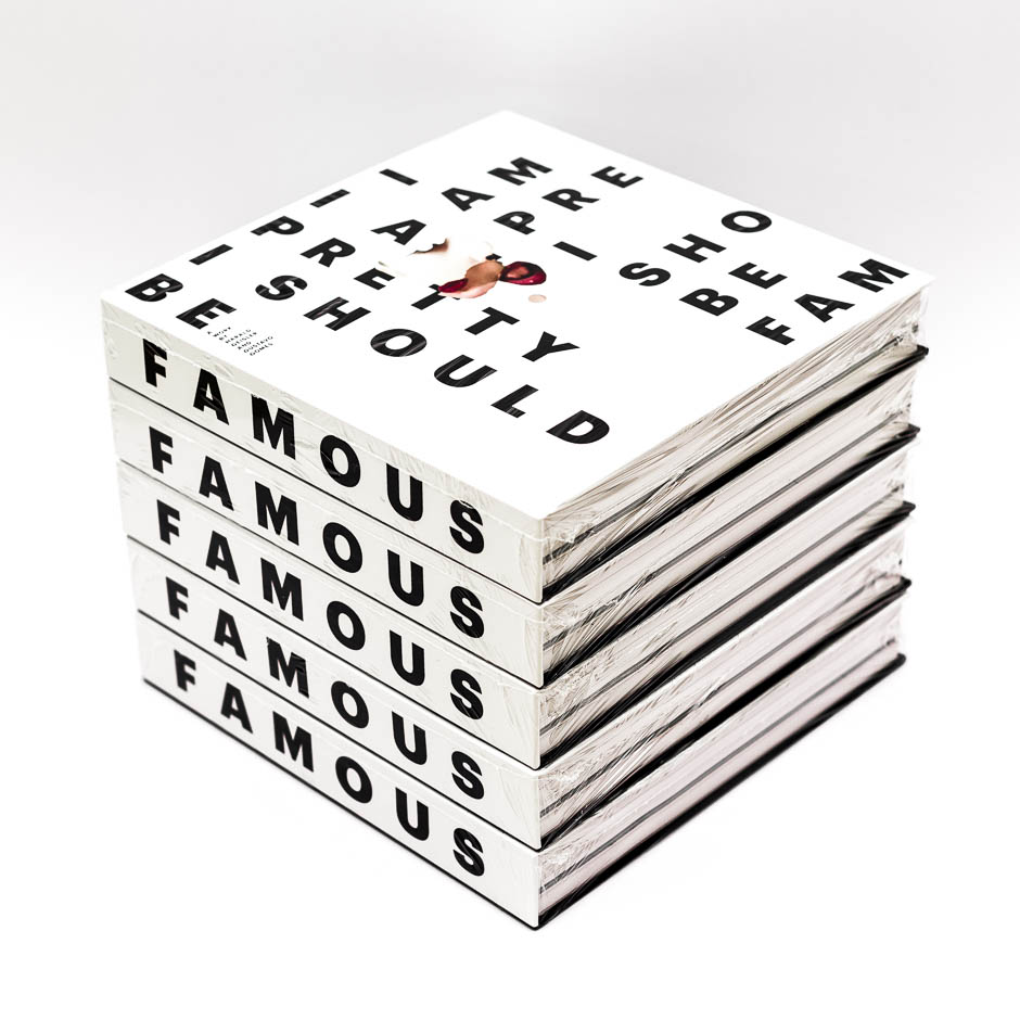
I AM PRETTY
I SHOULD BE FAMOUSI AM PRETTYI SHOULD BE FAMOUS is a work by typographer Harald Geisler and choreographer Gustavo Gomes. In collaboration with Artists: 552 pages in color.21cm x 21cmISBN 979-8344740195
Categories: Books -
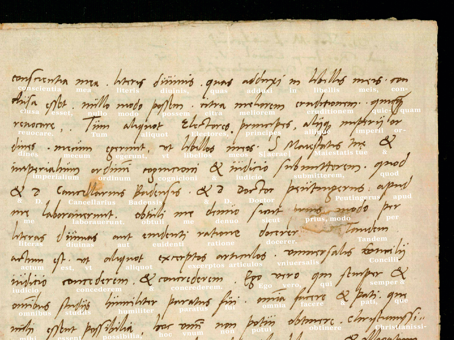
Martin Luther Font
I am a typographer and specialize in handwriting fonts. In the past, I created handwriting fonts based on Albert Einstein’s and Sigmund Freud’s handwriting. Now I am following up on the series and creating two new fonts, one based on Martin Luther’s manuscripts and then during 2018 to follow up with Martin Luther King’s handwriting.…
Categories: Fonts -
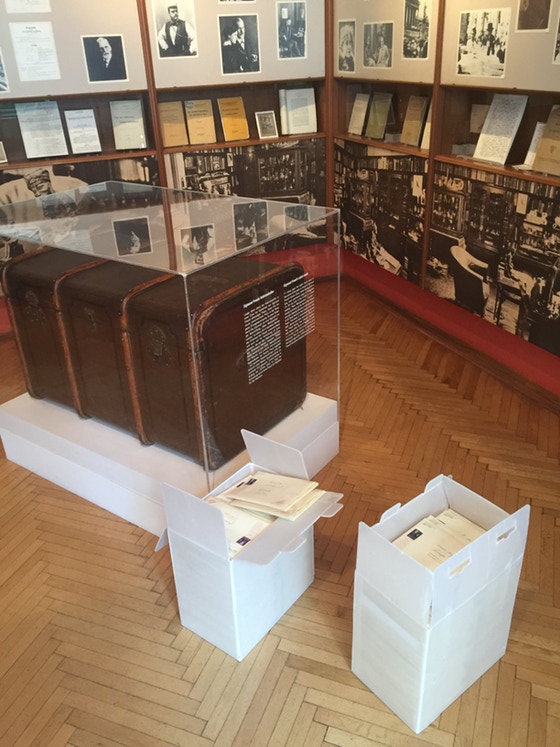
1932 Einstein / Freud Letters
The Kickstarter Campaign is over. But you can still join the conversation and receive the letters. This is included: The fonts can be ordered here:
Categories: Print